Say who it is for in the first two words
IM8 opens with "On a GLP-1?" and disqualifies most of the feed on purpose. A static ad has one rectangle to qualify a reader, and naming the audience does it faster than naming the product.
Image ad examples
Twenty static image ads, harvested from the public Meta Ad Library and shown as they ran. Under each one is the hook as it is set inside the frame, the pattern it belongs to, and what the frame is actually doing. Below the gallery are the six jobs a static ad has to do in one rectangle, and the four mistakes that waste the format.
Harvested from the Meta Ad Library. The quoted line on each card is the hook as it is set inside the creative. The line labelled Headline underneath is the ad own headline field, which is often a different sentence entirely.
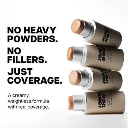
Negation stack
No heavy powders. No fillers. Just coverage.
Headline: Your Skin Foundation Stick
Three lines, two of them about what the product is not. Naming the objection before the benefit is the most reliable static-ad opening there is, because the reader has already had the thought.
See it in the Meta Ad Library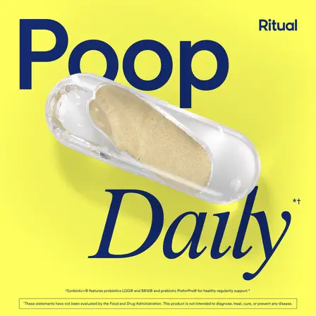
One blunt claim
Poop Daily
Headline: Poop Everyday with 3-in-1 Synbiotic+
Two words at magazine-cover scale. It is legible at thumbnail size, which is the real constraint on every ad in this gallery, and it says the outcome rather than the mechanism.
See it in the Meta Ad Library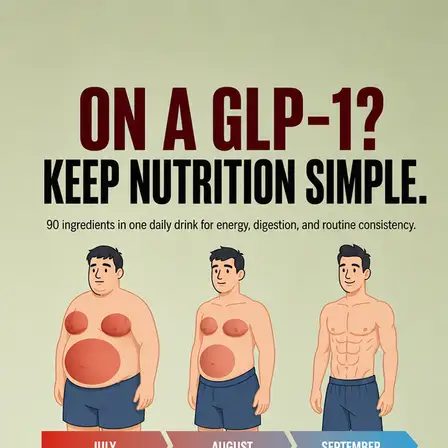
Audience call-out
On a GLP-1? Keep nutrition simple.
Headline: Support the Journey. Not Just the Goal.
The first two words disqualify almost everybody, on purpose. An ad that opens by naming who it is for wastes fewer impressions than one that opens by naming the product.
See it in the Meta Ad Library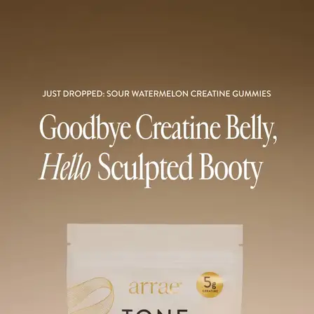
Before and after in one line
Goodbye creatine belly, hello sculpted booty
Headline: Just Dropped: The Juiciest Way to TONE 🍉
A whole transformation compressed into a single sentence with no image of either state. The reader supplies the pictures, which is cheaper to produce and harder to disbelieve.
See it in the Meta Ad Library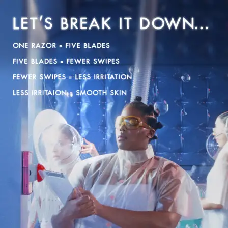
Spec ladder
Let us break it down. One razor, five blades, fewer swipes, less irritation, smooth skin.
Headline: Your New Fave Razor
A chain of consequences rather than a feature list. Each step is small enough to accept, and accepting all five means accepting the product.
See it in the Meta Ad Library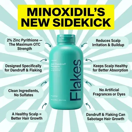
Annotated product
Minoxidil new sidekick
Headline: Get 20% Off + Free Gift ❄️👋
The product sits in the middle and six claims point at it. This is the densest frame in the gallery and it only works because the category is one where buyers read labels.
See it in the Meta Ad Library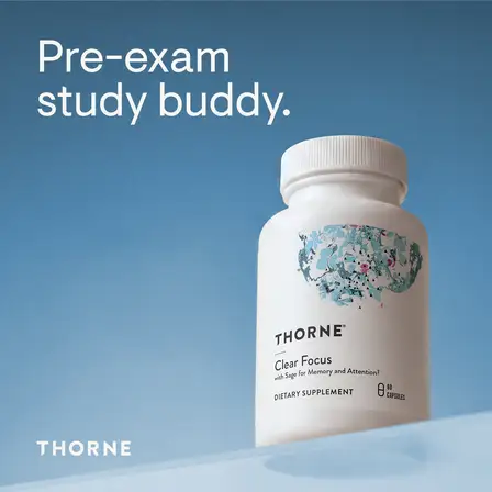
Occasion
Pre-exam study buddy.
Headline: Clean Focus Without More Caffeine.
The same supplement sold as a moment instead of an ingredient. Occasion framing is how a product with no new features gets a new campaign.
See it in the Meta Ad Library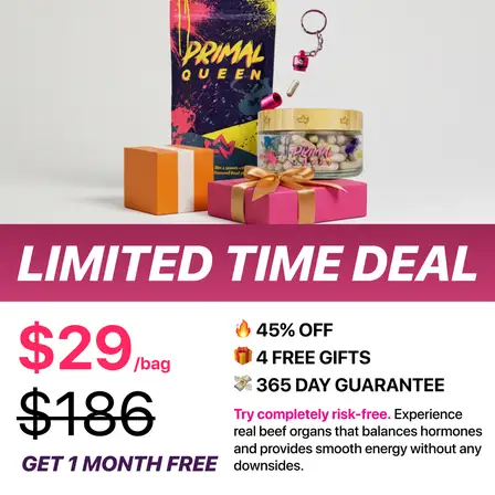
Price anchor
Limited time deal. $29 a bag, down from $186.
Headline: Are You Missing the Nutrients Your Body Is Starving For?
The old price is the biggest number in the frame and the new one is next to it. Nothing else in the ad has to work for this to be understood at a glance.
See it in the Meta Ad Library
Gift stack
Last call: $100 worth of free gifts
Headline: Pour Yourself a Better Cup of Coffee ☕️
The offer is not a discount, it is a pile of objects photographed as a pile. Volume is doing the persuading, which is why the items are shown rather than listed.
See it in the Meta Ad Library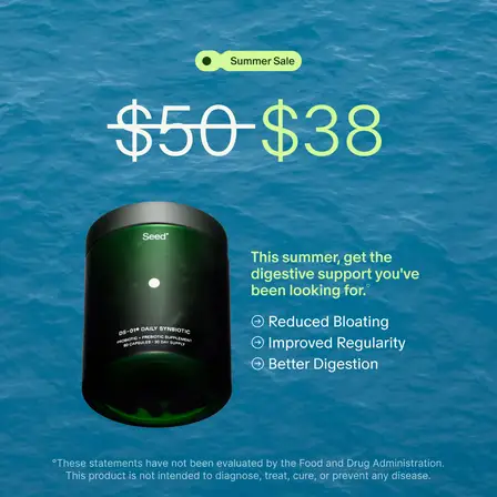
Struck-through price
$50 becomes $38
Headline: Bloat Less, Feel Better with DS-01®
One arithmetic operation as the entire creative. The product photograph is small and central, and the benefit bullets underneath are for the small number of readers who want them.
See it in the Meta Ad Library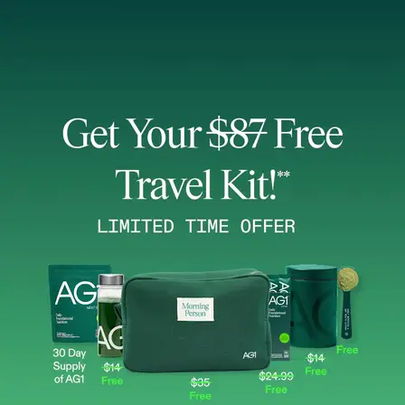
Free with purchase
Get your $87 free travel kit
Headline: Free Travel Kit, Made for the Road
A number attached to a free thing, which reads as a gift rather than a discount and leaves the product price untouched. The kit is laid out flat so its contents can be counted.
See it in the Meta Ad Library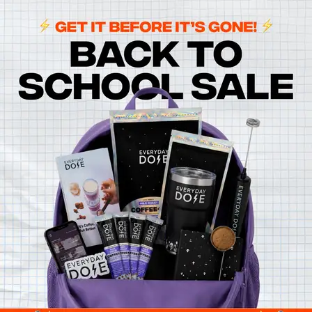
Deadline
Get it before it is gone. Back to school sale.
Headline: 62% OFF + FREE Gifts 🎁
Pure urgency with a calendar reason attached. Seasonal framing gives a sale a reason to exist, which is what stops it reading as a permanent discount.
See it in the Meta Ad Library
Pattern as the creative
Limited time only, up to 30% off
Headline: 🚨 Limited Time Only Offer 🚨
No product, no person, no photograph. A tiled brand pattern with an offer set in the middle, which survives at any crop and costs nothing to produce in ten variants.
See it in the Meta Ad Library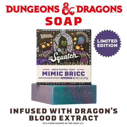
Collaboration
Dungeons and Dragons soap, infused with dragon blood extract
Headline: 🎲 Dungeons & Dragons: limited edition soap
The borrowed audience is the strategy. A licence turns a commodity product into something a specific group already wants to talk about.
See it in the Meta Ad Library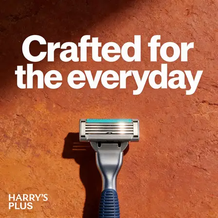
Product hero
Crafted for the everyday
Headline: Introducing Harry's Plus
One object, one shadow, three words. The oldest static ad there is, and it still works when the product is good looking and the category is understood.
See it in the Meta Ad Library
Product hero
Our Place
Headline: Non-Toxic Cookware from Our Place
A styled shelf and the brand name. Included here as the honest counterexample: it asks the reader to already care, and it is the shape most first-time advertisers reach for first.
See it in the Meta Ad Library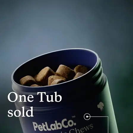
Scale as proof
One tub sold
Headline: America’s #1 Probiotic Chew for Dogs
A sales figure used as the whole headline. Social proof expressed as a count is the cheapest credibility a young brand can buy, and it needs no testimonial to stand up.
See it in the Meta Ad Library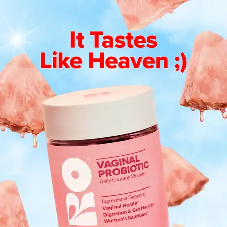
Review as the headline
It tastes like heaven ;)
Headline: NEW! URO Vaginal Probiotic Gummy
The customer voice, winking emoticon and all, set at headline size. Leaving the punctuation in is what makes it read as quoted rather than written.
See it in the Meta Ad Library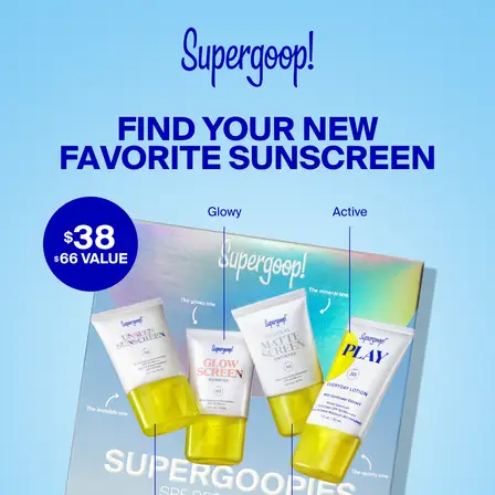
Bundle
Find your new favorite sunscreen
Headline: Supergoopies SPF Bestsellers
Several products shown together with one invitation over them. It sells the category rather than an item, which suits a buyer who has not chosen a format yet.
See it in the Meta Ad Library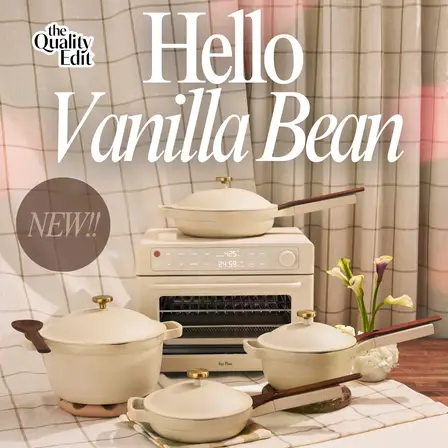
Borrowed editorial
Hello Vanilla Bean. New.
Headline: NEW COLOR! Vanilla Bean is here.
Styled as a magazine page rather than an ad, published by a review site rather than the brand. The format is the claim: this is coverage, not marketing.
See it in the Meta Ad LibraryA single frame cannot sequence an argument the way a carousel or a video can. These are the six moves the twenty ads above use instead.
IM8 opens with "On a GLP-1?" and disqualifies most of the feed on purpose. A static ad has one rectangle to qualify a reader, and naming the audience does it faster than naming the product.
Every frame that works here is legible at 200 pixels. Ritual sets two words at cover scale, Jones Road sets three lines. The dense annotated frames need a tap first, which is a cost, not a mistake, as long as it is deliberate.
Jones Road spends two of three lines on what the product does not contain. Billie spends the frame on consequences rather than features. The reader has already had the doubt, and an ad that gets there first is believed more easily.
Six of these twenty lead on a figure: $87, $100, $29 from $186, $50 to $38, 30% off, one tub sold. In each case the figure is the largest element and the product photograph is decoration.
O Positiv sets a customer review at headline size. The Quality Edit publishes an ad styled as editorial coverage. Dr. Squatch borrows a licence. All three are buying credibility the brand does not have on its own.
Everyday Dose attaches its discount to back to school. Alice Mushrooms attaches one to a shopping event. A discount with a calendar reason expires. A discount without one teaches buyers to wait.
Each card above shows two lines of copy, and they rarely match. The quoted line is the text set into the image, which is what a scrolling buyer actually reads. The line labelled Headline is the separate text field the advertiser filled in, which appears under the creative in the feed and is frequently a plain product name.
Supergoop is the clearest case in this set. The creative says "Find your new favorite sunscreen" while the headline field says "Supergoopies SPF Bestsellers". Quoting the headline alone, which is what most roundups do because it is the field an export gives you, would describe an ad nobody ran. If you are studying competitors, read the pixels, not the spreadsheet, and read them across a whole advertiser set the way the LinkedIn ad examples do. The same discipline applies to a carousel, where the argument is spread across frames rather than compressed into one.
Our Place is in this gallery as the counterexample. A styled product photograph with the brand name over it asks the reader to already care, and most of a cold feed does not. It is the shape new advertisers reach for first and the one that needs the most brand equity to work.
The Flakes frame carries six claims around the bottle. It earns its density in a category where people read labels. The same treatment on an impulse product is a frame nobody decodes before scrolling past.
Five of these twenty are discount-led and only two name an occasion. A permanent offer stops being an offer, and a brand that always has 30% off has simply repriced itself while paying for the ad twice.
These twenty frames use maybe six arguments between them. The type treatment is the least transferable thing in any of them. Take the pattern, run it against what your own product can prove, and let the design follow.
An image ad is a single static creative, one frame with no video and no swipe, carrying its whole argument in one rectangle. It is the cheapest ad format to produce and the most common one running on Facebook and Instagram.
All twenty were harvested from the public Meta Ad Library, which is free and needs no advertising account. Each card links the permalink for the ad it came from, so any example here can be checked at the source.
Every creative in this gallery is square. Square is the safe default across Facebook and Instagram feeds because it fills the column on mobile without being cropped, and the same file can run in several placements.
Most of the frames that work here carry between two and eight words. Denser frames exist in this gallery and they belong to categories where buyers read labels. If the line is not legible at thumbnail size, it is not doing any work.
Every brand in this gallery was running static image ads on the day the set was harvested, alongside their video. Static is cheap enough to run many versions of, which is what makes it useful for finding the argument before spending on production.
Selzee is your AI content team. It researches what your market is arguing, turns it into concepts, and writes the frames, so a pattern you just read becomes your next campaign instead of a screenshot in a folder.
Make your next image ad with SelzeeKeep exploring: LinkedIn ad examples, Carousel ad examples, UGC ad examples, Find competitor ads.