Start inside the situation
Three of these open mid-scenario: when you hear "I have a tummy ache", two weeks of this and we are ready for daycare, summer bedtime is a battle. The viewer is placed in a moment they recognise before any product exists.
UGC ad examples
Twenty UGC ads running from Hiya, Bombas and Beis, harvested from the public Meta Ad Library on 14 September 2026. These are videos, so each card shows the opening frame, which is the only part that has to work on its own: it is what a thumb sees before it decides. Under the gallery are the six openers they use and the four notes that ruin the format.
Harvested from the Meta Ad Library. The quoted line is the caption or the spoken opener on that first frame. Where a frame carries no type at all, the line describes what is in the shot instead.
Phone screenshot as the opener
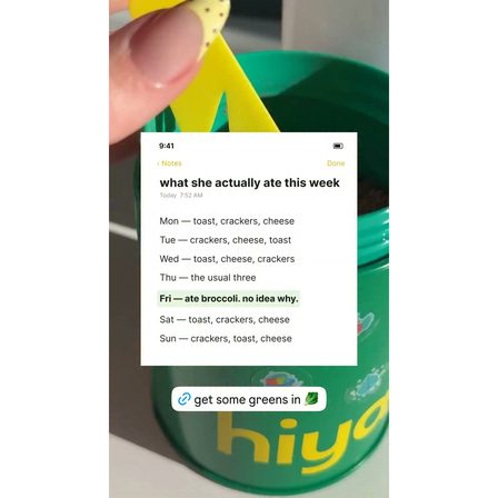
What she actually ate this week
The first frame is a note on a phone listing toast, crackers and cheese seven days running. It is the most honest artefact in this gallery and no brand asset appears until later in the video.
See it in the Meta Ad Library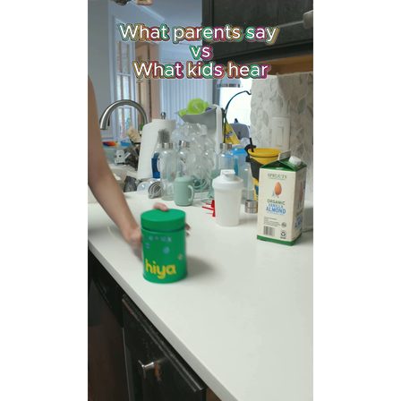
Two columns of dialogue
What parents say versus what kids hear
A format borrowed straight from organic social. The joke is the hook, the product is the punchline, and the structure is legible in a still, which is why it survives the mute autoplay.
See it in the Meta Ad Library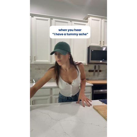
When you hear
When you hear "I have a tummy ache"
A caption that starts mid-scenario. The reader is inside the situation before the brand is mentioned, which is the whole trick of the format and the reason it does not read as an ad.
See it in the Meta Ad Library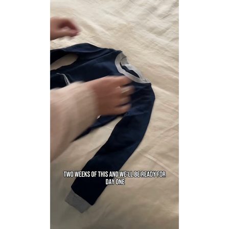
Time-bound result
Two weeks of this and we are ready for daycare
A claim with a clock on it, spoken as a parent would say it rather than as a brand would write it. The frame is laundry on a bed. Nothing is styled.
See it in the Meta Ad Library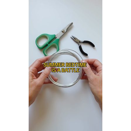
Name the recurring fight
Summer bedtime is a battle
Four words naming a nightly argument the audience is having. It is the highest-recognition opener in this set and it says nothing about the product at all.
See it in the Meta Ad Library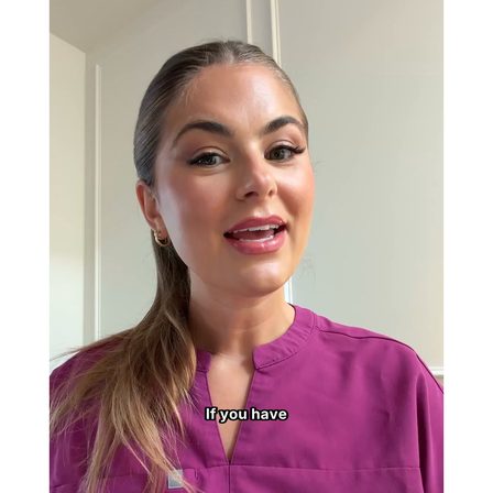
Borrowed authority, filmed at home
If you have
A creator in scrubs, shot on a phone in a hallway. The uniform is the credential and the production values are deliberately domestic. Both signals are doing work at once.
See it in the Meta Ad Library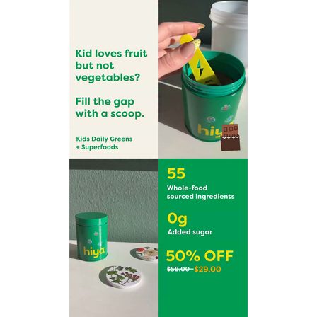
Question then mechanism
Kid loves fruit but not vegetables? Fill the gap with a scoop.
The most brand-produced frame in this gallery, with an offer and an ingredient count set in type. It is included to show the line: past this point the ad stops passing as a post.
See it in the Meta Ad Library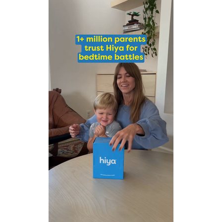
Scale as reassurance
More than a million parents trust Hiya for bedtime battles
Social proof laid over a domestic scene rather than a product shot. The number reassures, the setting keeps it from reading like a billboard.
See it in the Meta Ad Library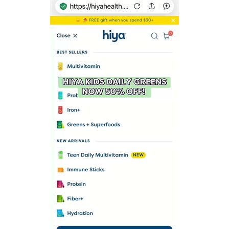
Screen recording
Hiya kids daily greens, now 50% off
The opener is somebody scrolling the shop on their own phone, thumb visible. Screen recordings work because they look like a recommendation being shown to you rather than an ad being served.
See it in the Meta Ad Library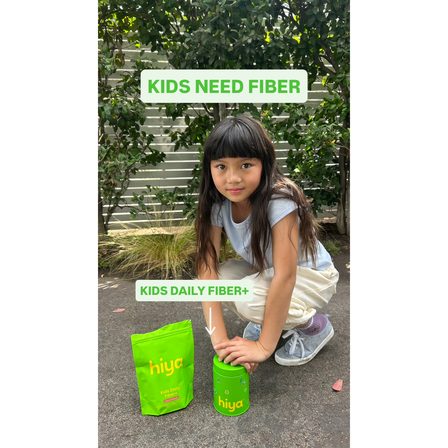
Flat statement
Kids need fiber
Three words, a child outdoors, a product name underneath. The plainest opener here, and the one that most resembles a headline rather than a post.
See it in the Meta Ad Library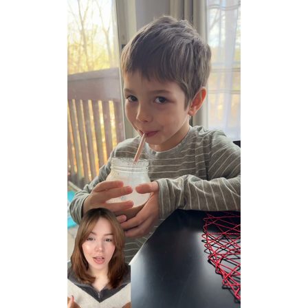
Reaction inset
A child drinking, with the creator reacting in the corner
Two videos in one frame, the format every platform trained its audience on. The inset tells the viewer how to feel about the main shot before they have decided for themselves.
See it in the Meta Ad Library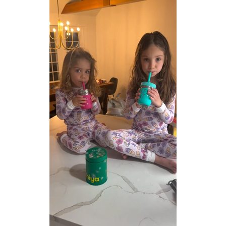
No caption at all
Two children in pyjamas on the floor, mid-routine
No overlay, no type, no logo in the opening frame. It buys attention purely by looking like something a friend filmed, and it is the riskiest opener in the gallery.
See it in the Meta Ad Library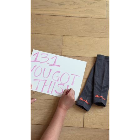
Handwritten prop
13.1, you got this
A hand-lettered sign next to the product. Handwriting is the cheapest credibility signal there is, and no typeface in a brand system can reproduce it.
See it in the Meta Ad Library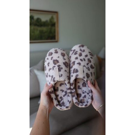
Product in situ
Slippers on an unmade bed
The product photographed where it is actually used, at the angle a phone is held at. Compare it with any catalogue shot: the difference is entirely the mess around it.
See it in the Meta Ad Library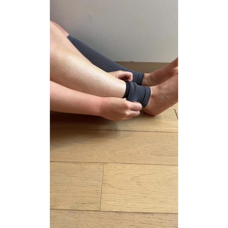
Close crop on the problem
An ankle, a sock, a wooden floor
The camera is on the body part the product serves, not on the product range. For an apparel basic this is the fastest way to say what it is for without a word of copy.
See it in the Meta Ad Library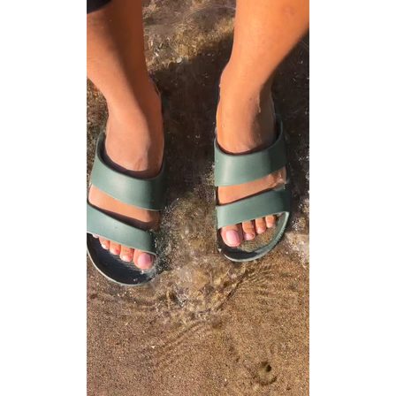
Point of view
Looking down at your own feet
Shot from the wearer eyeline, which is the composition organic phone video invented and advertising borrowed. It puts the viewer in the shoes rather than in front of them.
See it in the Meta Ad Library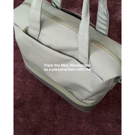
Do it with me
Pack the Mini Weekender as a personal item with me
The strongest verb construction in the format. It promises a demonstration rather than a claim, and the viewer stays for the answer to a practical question they already have.
See it in the Meta Ad Library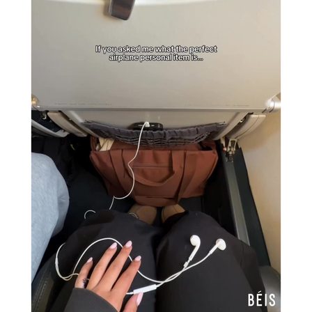
Proof in one shot
The bag, filmed fitting under the seat
The single objection for a cabin bag is whether it fits. The ad answers it in the opening frame, on a real aircraft floor, rather than claiming dimensions.
See it in the Meta Ad Library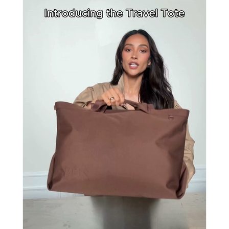
Creator as the launch
Introducing the Travel Tote
A product launch delivered by a person holding the product in a bedroom. The word "introducing" is brand language and the setting is not, which is the compromise most DTC launches now run.
See it in the Meta Ad Library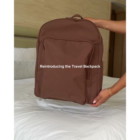
Hands only
Reintroducing the Travel Backpack
No face, just hands placing the bag on a bed. Faceless UGC is cheaper to produce, easier to localise and, on a mute autoplay, loses almost nothing.
See it in the Meta Ad LibraryA UGC ad has about one second of muted autoplay to earn the next one. These are the six ways the gallery above spends it.
Three of these open mid-scenario: when you hear "I have a tummy ache", two weeks of this and we are ready for daycare, summer bedtime is a battle. The viewer is placed in a moment they recognise before any product exists.
A phone note listing what a child actually ate. A handwritten race sign. A screen recording of somebody browsing the shop. Artefacts read as evidence because nobody would bother faking one, which is exactly why brands now do.
The cabin bag ad opens on the bag going under an aircraft seat. For products with a single yes or no question attached, demonstrating it immediately beats every headline you could write over it.
Pack this with me. The construction promises a demonstration and sets an implicit contract that the video will finish something. It is the most reliable retention device in the format.
A creator in scrubs filmed in a hallway. The uniform does the authority, the phone camera does the trust. Shooting that same person in a studio would cost more and convert worse.
Several of the strongest openers here have no face at all: hands, feet, a bed, a screen. Faceless UGC is cheaper, easier to run in several markets, and loses almost nothing on a muted autoplay.
Two frames in this gallery break the spell on purpose. One sets an ingredient count and a discount in brand type. Another states a trust figure over a domestic scene. Both are recognisably advertising within a quarter of a second, and both are running alongside the ads that are not.
That is not a mistake, it is a different job. An opener that passes as a post buys attention from someone who has never heard of you. An opener that announces itself as an offer converts someone who already has. The error is running only one of the two, or briefing a creator to make the second while paying for the production values of the first. The UGC script guide covers the brief itself, and the image ad examples show the polished end of the same spectrum.
The openers that work here are sentences a parent or a traveller would actually say. A creator reading brand copy produces the worst of both: the production values of a phone video and the credibility of an ad.
The laundry is unfolded, the bed is unmade, the floor is scuffed. Every one of those is doing work. A tidied, colour-graded opening frame announces the ad before the viewer has heard a word.
Almost none of these do. The brand arrives after the situation has landed. A logo in the first frame gives a scrolling thumb everything it needs to decide this is not for them.
These frames look unfinished because unfinished is the signal. The internal review that asks for better lighting is the same review that removes the reason the format works.
A UGC ad is a paid ad made to look like content a customer or creator posted themselves: filmed on a phone, unpolished, and usually opening on a situation rather than a product. The brand still commissions and pays for it, which is what separates it from genuine user content.
The Meta Ad Library is public, free, and needs no advertising account. Every example on this page was harvested from it on 14 September 2026, and each card links the entry for the full video.
Start inside a situation the viewer recognises, or show an artefact rather than a product. The openers in this gallery that work are sentences a real person would say out loud, and several of them contain no product reference at all.
No. Several of the strongest openers on this page show hands, feet, a bed or a phone screen. Faceless UGC is cheaper to produce, easier to run across markets, and loses very little on an autoplay that starts muted.
The gallery shows the line. Frames with an offer, an ingredient count or a discount set in type stop passing as posts. That is a legitimate choice further down the funnel, but it is a different ad doing a different job.
Selzee is your AI content team. It researches what your market is arguing, turns it into concepts, and writes the hooks and briefs, so your creators film an argument that has already been thought through.
Write your next UGC brief with SelzeeKeep exploring: UGC script guide, Image ad examples, Carousel ad examples, Find competitor ads.