



Display ad examples

Display Ad Examples: 12 Real Banner Units From the Google Archive

Twelve real display units captured from the Google Ads Transparency Center on 14 September 2026, each rendered by the archive as a 300 by 250 medium rectangle. One pair in the gallery is the same image and description running under two different headlines, and a second pair is one photograph running with the headline and description stripped away. That is the single most useful thing to understand about the format. Below the gallery are the six rules those twelve follow and the four mistakes that waste a display budget.

Twelve real display units

The archive renders every one of these as a 300 by 250 medium rectangle, which is how they are captured here. The name on each card is the site the ad points at. The verified advertiser, which the archive records separately, is named underneath.

A display ad for Awakening Sanctuaries headed "Book your Sanctuary Session"
Awakening Sanctuaries 300 x 250

Verb first

Book your Sanctuary Session

Read this card together with the one beside it. Same photograph, same description, different headline, running as two separate ads at the same time. That pairing is the clearest thing in this gallery.

Verified advertiser: Wix.com Inc.

See it in the Google Ads Transparency Center
A display ad for Awakening Sanctuaries headed "Virtual or in-person sessions"
Awakening Sanctuaries 300 x 250

Logistics first

Virtual or in-person sessions

The same assets as the card on its left with one line swapped. One headline asks for the booking, the other answers the question that decides it. Testing at that level costs nothing and is most of what display optimisation actually is.

Verified advertiser: Wix.com Inc.

See it in the Google Ads Transparency Center
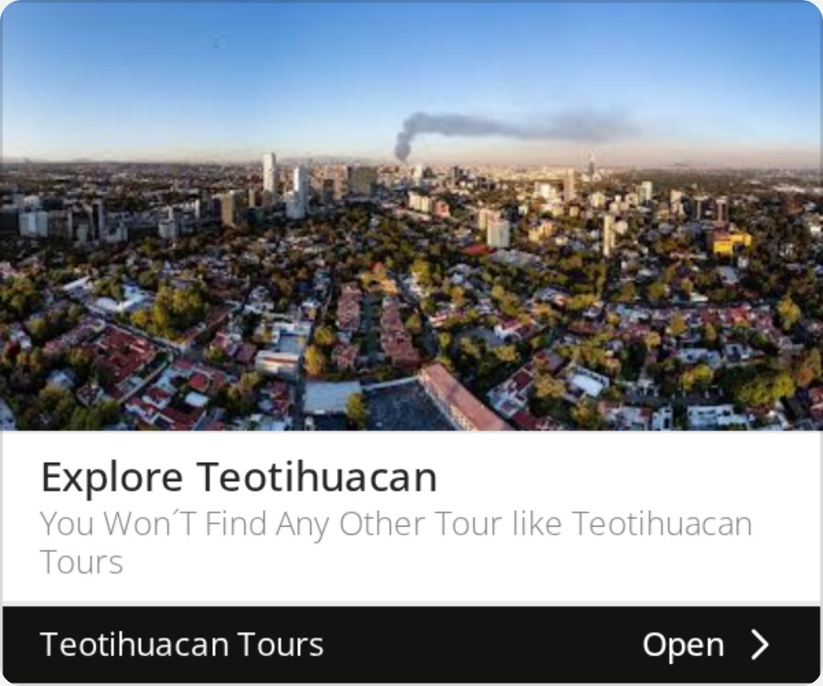
A display ad for Teotihuacan Tours headed "Explore Teotihuacan" over an aerial photograph
Teotihuacan Tours 300 x 250

Place as the image

Explore Teotihuacan

A destination photograph, a verb and a claim about the tour. Travel is one of the few categories where the image can carry the argument on its own, and this unit still puts a sentence under it.

Verified advertiser: Wix.com Inc.

See it in the Google Ads Transparency Center
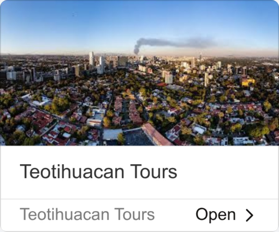
A display ad showing the same aerial photograph under only the name Teotihuacan Tours
Teotihuacan Tours 300 x 250

No claim at all

Teotihuacan Tours

The same photograph as the card before it, with the business name where the headline was. Nothing is claimed, so nothing can be believed. This is the weakest unit in the gallery and it is running next to the strongest.

Verified advertiser: Wix.com Inc.

See it in the Google Ads Transparency Center
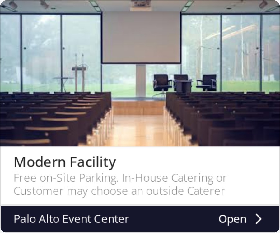
A display ad for Palo Alto Event Center showing an event room, headed "Modern Facility"
Palo Alto Event Center 300 x 250

Objection in the description

Modern Facility

The headline is forgettable and the description is not: free on-site parking, in-house catering or your own caterer. Those are the two questions that actually decide a venue enquiry, answered before the click.

Verified advertiser: Wix.com Inc.

See it in the Google Ads Transparency Center
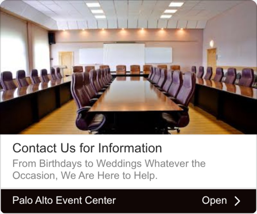
A display ad for Palo Alto Event Center showing a boardroom, headed "Contact Us for Information"
Palo Alto Event Center 300 x 250

Room as the proof

Contact Us for Information

The weakest headline in this set paired with the most useful image. A photograph of the actual boardroom does the persuading while the headline asks for a click it has not earned.

Verified advertiser: Wix.com Inc.

See it in the Google Ads Transparency Center
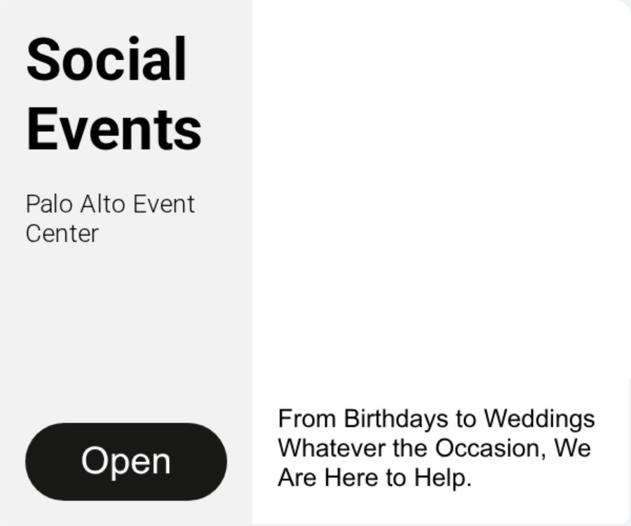
A display ad for Palo Alto Event Center headed "Social Events"
Palo Alto Event Center 300 x 250

Category headline

Social Events

The third unit from the same venue, and the one aimed furthest up the funnel. Two words naming the category rather than the building, for a reader who has not yet decided what kind of supplier they need.

Verified advertiser: Wix.com Inc.

See it in the Google Ads Transparency Center
A display ad for Industrial Sealing showing an ISO 27001 badge beside the headline "API 682 Seal Upgrades"
Industrial Sealing 300 x 250

Certification as the image

API 682 Seal Upgrades

An ISO 27001 badge fills the image slot instead of a product. In a compliance-driven category the badge is the offer, and a badge stays legible at sizes that would destroy a photograph.

Verified advertiser: Wix.com Inc.

See it in the Google Ads Transparency Center
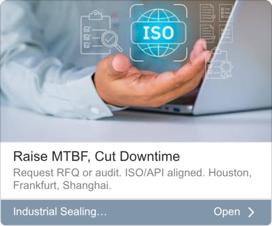
A display ad for Industrial Sealing headed "Raise MTBF, Cut Downtime"
Industrial Sealing 300 x 250

Jargon as qualification

Raise MTBF, Cut Downtime

An acronym in the headline that most readers cannot expand. That is the point: it speaks to reliability engineers and to nobody else, which is a rational trade in a market of a few thousand buyers.

Verified advertiser: Wix.com Inc.

See it in the Google Ads Transparency Center
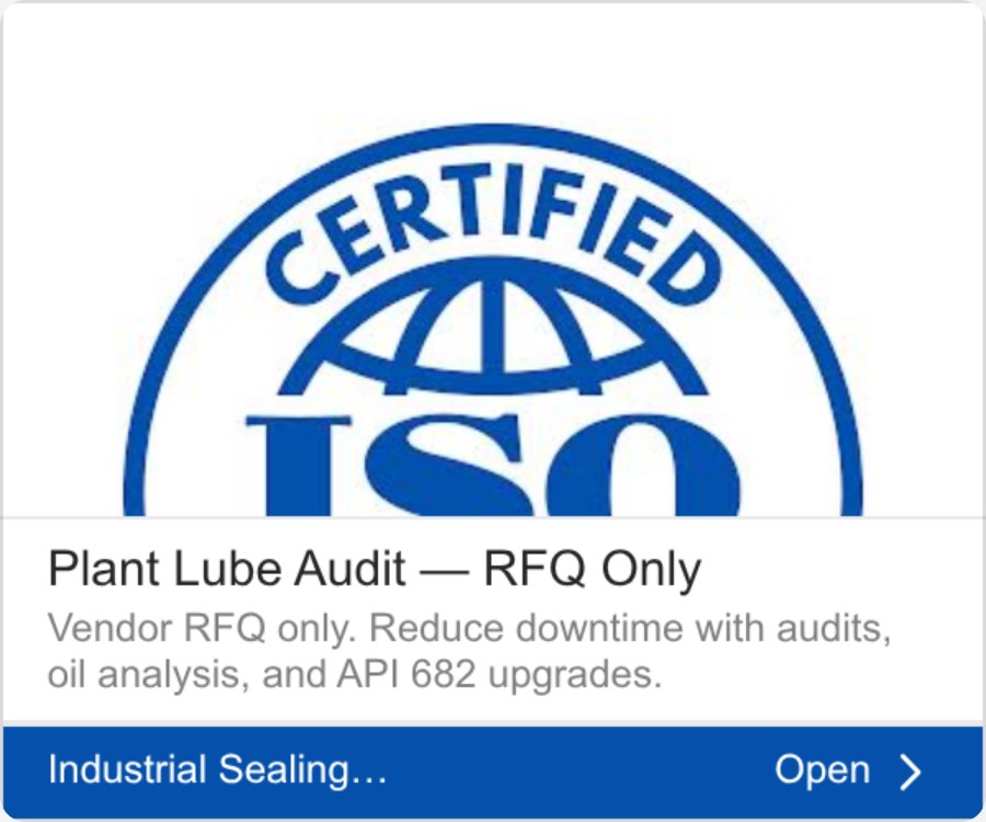
A display ad for Industrial Sealing showing a certification badge above a plant lube audit offer
Industrial Sealing 300 x 250

Disqualify in the headline

Plant lube audit, RFQ only

The third unit from the same site. Its description says "B2B only" out loud. Read as a set, the three cover awareness, qualification and action with one image library and three headlines.

Verified advertiser: Wix.com Inc.

See it in the Google Ads Transparency Center
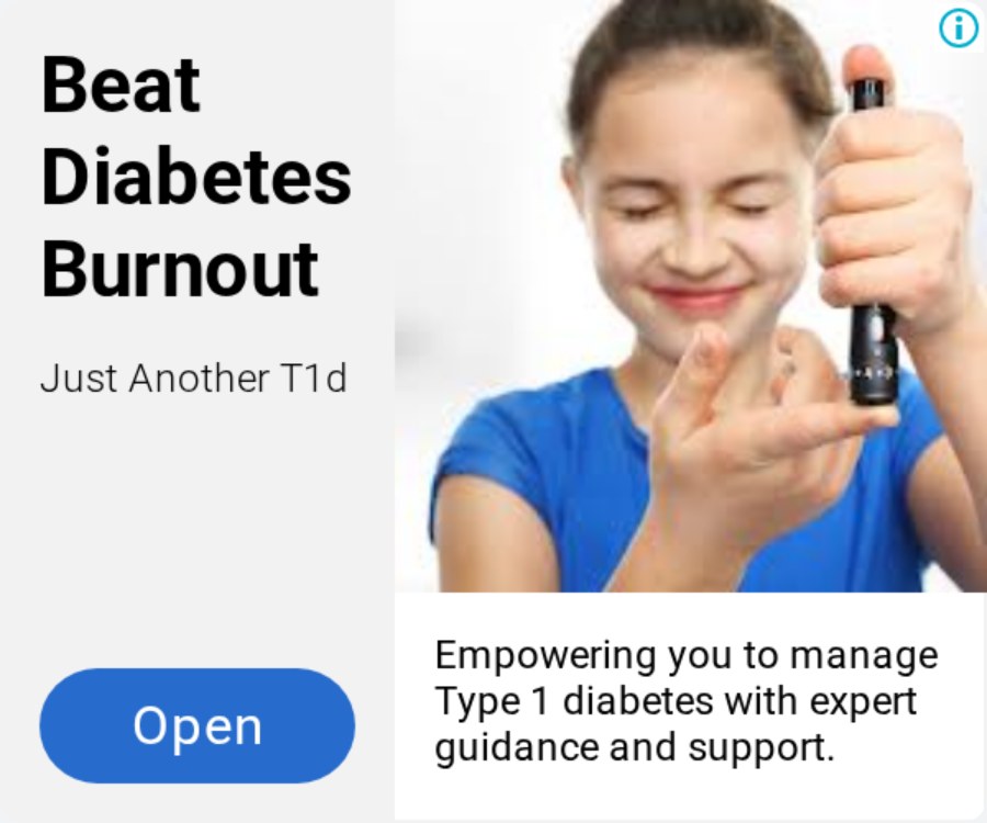
A display ad reading "Beat Diabetes Burnout" beside a photograph of a child holding a dropper bottle
Just Another T1d 300 x 250

Name the feeling

Beat Diabetes Burnout

Three words naming a state the audience already recognises, with no product claim anywhere in the frame. The strongest headline in this gallery, and it belongs to the smallest advertiser in it.

Verified advertiser: Wix.com Inc.

See it in the Google Ads Transparency Center
A display ad for Modern Manbo headed "New horizons in Fashion"
Modern Manbo 300 x 250

Heritage as the claim

New horizons in Fashion

A fashion photograph, a soft headline and a description that does the real work: embracing Haitian Vodou heritage in luxury fashion. The specific sentence is underneath the vague one, which is the wrong way round.

Verified advertiser: Wix.com Inc.

See it in the Google Ads Transparency Center

Key takeaways

  • Responsive display means you write parts, not a banner. The first two cards are the same image and description with one headline swapped.
  • The headline gets about four words in a narrow unit before it wraps. Write for that, not for the wide one.
  • The image slot does the qualifying. A certification badge, a real room and a destination all beat a product shot here.
  • The description is where the objection gets answered, which is why one venue spends it on parking and catering.
  • The weakest unit in the gallery is the one whose headline is just the business name, and it runs on the same photograph as the strongest.

The six rules these twelve units follow

Display is the only major format where the advertiser does not control the layout. That single fact produces all six.

Rule

You are writing parts, not a banner

Responsive display takes a headline, a description, an image and a logo, then assembles them into whatever slot is available. The two Awakening Sanctuaries units here share an image and a description and differ by one line. Nobody designed either layout.

Rule

The headline has to survive the narrow unit

Every unit here gives the headline about four words before it wraps. "Beat Diabetes Burnout" and "Explore Teotihuacan" work at any size. A headline that needs a wide slot will be unreadable in most of the inventory it runs in.

Rule

The image slot is not for your product

One of these twelve puts a certification badge in the image slot, one puts the actual room, one puts the destination. In display the image is the qualifier, and it is often doing more work than the headline it sits under.

Rule

The description answers the objection

Palo Alto Event Center spends its description on parking and catering rules. That is the format working properly: the headline stops the eye, and the description answers the question that decides the click.

Rule

Display readers have no intent yet

Nobody searched for these. They were reading something else. That is why the Teotihuacan unit carrying only the business name is the weakest in this gallery, while the same photograph under a verb is the strongest.

Rule

One site, several headlines, one image library

Industrial Sealing runs three units here and the venue runs another three. Same look, same assets, different headline per job. This is what running display properly looks like at small scale.

The same assets, running twice, with one line changed

The first two cards in the gallery carry the same photograph and the same description. Only the headline differs: one asks for the booking, the other answers the question that decides it. They are two separate ads, running at the same time, from the same four parts. A few cards further down, Teotihuacan Tours does the same thing with one photograph, once under a verb and once under nothing but the business name.

Everything else on this page follows from that. It is why the headline has to survive four words, why the image has to be legible at thumbnail scale, and why time spent perfecting a fixed banner is time spent on something the network will rebuild anyway. The parts are the creative work. The layout is not yours. On the feed formats you do control the frame, which is why the image ad examples can spend it on a hook and these cannot.

Four ways a display budget gets wasted

  • Putting the business name in the headline slot

    A display reader was doing something else a second ago and has no intent to satisfy. A name gives them nothing to react to. The Teotihuacan name-only unit in this gallery is the honest example, and its twin proves the fix costs one line.

  • Writing a headline that only fits the widest unit

    Most display inventory is narrow. If the line does not hold up in four words, it will run truncated in the majority of the placements it wins, and the ad will be judged on a sentence nobody finished.

  • Treating the image as decoration

    The badge, the boardroom and the destination photograph in this gallery are each doing the qualifying. A generic stock image in that slot wastes the one element that is legible at every size.

  • Designing a fixed banner in 2026

    The units here were assembled by Google from parts. Time spent perfecting a layout is spent on something the network will rebuild anyway. Spend it on the headline and the image instead.

Display ad examples: common questions

01 What is a display ad? +

A display ad is an image or banner ad shown on websites, apps and YouTube rather than in a search result. Most are now responsive: the advertiser supplies a headline, a description, an image and a logo, and the network assembles them into whatever ad slot is available.

02 Where can I see real display ads for free? +

The Google Ads Transparency Center is public and needs no account. It shows the ads an advertiser is running, the regions they are shown in, and when each was last served. The twelve units on this page were captured from it on 14 September 2026.

03 What are the standard display ad sizes? +

Responsive display ads have no single size. The network builds them to fit whatever slot is available, which is why you write a headline, a description, an image and a logo rather than a banner. Fixed sizes such as 300 by 250 and 728 by 90 still exist, but the parts are what you supply now.

04 How long should a display ad headline be? +

Short enough to read in the narrow unit. The headlines that hold up across every unit in this gallery run to three or four words. Anything longer is truncated in most of the inventory a campaign actually wins.

05 Why do these ads all name the same advertiser? +

The verified advertiser on all twelve is Wix.com Inc., which is confirmed on each ad detail page in the archive. The business named inside each creative is the site the ad points at. It is a useful reminder that the advertiser field in any public archive is the payer, not always the brand in the picture.

Selzee is your AI content team. It researches what your market is arguing, turns it into concepts, and writes the headline and description variants display needs, so you are testing arguments instead of resizing banners.

Write your next display ad with Selzee

Keep exploring: Image ad examples, LinkedIn ad examples, Carousel ad examples, Find competitor ads.

ask ai about selzee

© 2026 Selzee. All rights reserved.