Playbook · Creative ops
Ad Creative Design for Paid Social: An Operating Guide
Most paid social creative does not fail because it looks bad. It fails because the team could not produce enough distinct, well briefed ideas to find the one that works.
Most paid social creative does not fail because the design is bad. It fails because the team never shipped enough distinct ideas for a good one to surface.
That is an operating problem, not a taste problem. Motion's 2026 benchmark data puts the winner rate between 4 and 8% of creatives depending on account tier, and spend concentrates hard on the few that clear the bar: around 55% of total spend lands on winning ads, while roughly half of everything produced is switched off inside 28 days (Motion Creative Benchmarks 2026). Hit rate also climbs with tier in that data, from about 3.8% at micro spend to 8.2% at enterprise, and the higher-spending accounts are the ones shipping the most creatives per week. Read that as a description of what high output accounts look like rather than proof that volume by itself lifts any single ad, but the floor holds either way: at a 4 to 8% hit rate, a team shipping two ads a week is not taking enough shots to find a winner reliably. The tier by tier breakdown sits in our competitor advertising research.
What this means for a DTC brand: the design brief is not "make a great ad." It is "produce enough genuinely different bets that a great one can surface, and retire the rest without ceremony."
So the question stops being whether the ad looks premium. It becomes whether the ad earns the next test. This guide is about the system that produces that: who owns what, how an angle turns into a brief a creator can actually film, and how to set win and kill thresholds you can defend, with the test design itself covered in our ad creative testing framework.
Why is ad creative design a volume problem now?
A lot of DTC teams still treat creative like a launch asset. One concept, a few edits, then a wait and see period. That model breaks in paid social because the feed punishes repetition, and because one asset cannot tell you why it worked.
Creative is also the most valuable thing you can still fix. Nielsen and NCSolutions found that when creative is strong it drives the large majority of in market success, up to 89% of sales lift in digital advertising and around 80% in traditional TV (Nielsen, 2017). That figure is nine years old now and it is conditional, it describes what strong creative does rather than what average creative does.
What this means for a DTC brand: if the account is already spending, improve the ad before you spend another week arguing about targeting layers.
Practical rule: the ad is the variable with the most room left in it. Treat targeting changes as the cheap experiment and creative changes as the real one.
What actually changes when creative becomes a volume game?
The job changes from making assets to managing throughput. Once you accept that most concepts will not become durable winners, the priority stops being polish alone and becomes idea velocity, test quality, and clean learning.
A good week is no longer a week where the team made something beautiful. It is a week where the team produced enough distinct tests, learned something specific about buyer response, and turned that into the next round before production stalled.
Volume is not really about making more files. It is about making more decision quality inputs. Ship ten ads that all express the same belief in slightly different clothes and output looks high while learning stays flat. Ship six that each clarify a different tension, objection, or proof structure and the system gets smarter.
The bottleneck also moves upstream. The scarce resource is rarely editing capacity or design taste. It is angle clarity, proof availability, and the ability to hand off a brief sharp enough to survive production without dissolving into opinion. Teams who only add editing capacity often feel busier without feeling more effective, because they solved throughput at the bottom of the system and left ambiguity at the top. Closing that ambiguity is what a creative strategy is for.
Which roles have to exist to sustain weekly output?
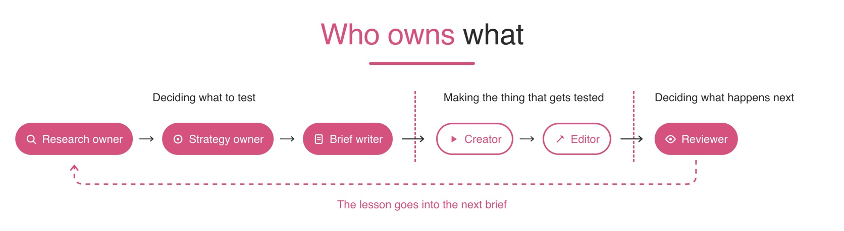
The same functions have to exist even when a lean team combines them across fewer people. Someone finds the signal, someone defines the angle, someone writes the brief, someone captures the footage, someone builds the variants, and someone reads the results without defending the asset.
- Research owner. Collects buyer language, support friction, objections, review themes, comments, and competitor patterns. The job is not to come back with exciting ideas. It is to come back with tensions specific enough to brief.
- Strategy or performance owner. Decides what the next round is supposed to learn: a pain point, a proof sequence, a mechanism belief, an objection, or a buyer state. Protects the difference between a broad insight and a testable angle.
- Brief writer. Turns the chosen angle into one message, one proof requirement, and clear creator instruction. Removes avoidable ambiguity before production starts.
- Creator or producer. Captures the raw material, and needs to know what has to be shown rather than just the mood. If the proof depends on a specific visible moment, that moment gets captured on purpose.
- Editor. Converts raw material into distinct executions, expressing one angle through multiple openings, proof orders, and pacing choices so the team can isolate what moved response.
- Reviewer or decision owner. Reads the results and names the next step. Close enough to performance to see the commercial picture, detached enough from the asset to kill weak ideas cleanly.
The distinction that matters is between deciding what to test and making the thing that gets tested. When one person owns both the brief and the edit, the first thing that breaks is not effort. It is clarity.
The brief gets softer because the editor assumes they can figure it out in the timeline. The edit gets more subjective because the strategy was never locked. The review gets defensive because the same person is attached to both the concept and the execution.
The failure modes show up fast:
- The brief names a theme, not a claim.
- The proof requirement goes unstated, so the footage comes back generic.
- The edit compensates with pacing tricks instead of message clarity.
- Review becomes a debate about taste instead of a diagnosis of the test.
- Weak ideas live too long because nobody wants to kill their own work.
Separating these does not require a big org chart. It requires named ownership at each stage, so each stage gets judged by a different standard.
What does the pipeline look like stage by stage?
A working pipeline is a chain of work with a decision at each handoff. If nobody can say what the output of a stage is, that stage is not stable yet.
| Stage | Output that has to exist before the next stage |
|---|---|
| Signal collection | A bank of real buyer tensions in plain language |
| Signal sorting | A shortlist of territories worth exploring |
| Angle selection | One angle framed as a belief to change or confirm |
| Brief writing | Instruction, not inspiration: mindset, message, proof, exclusions, judgement |
| Hook development | A family of openings that all solve the same tension in different language |
| Production planning | A shot plan or creator ask that prevents reshoots |
| Raw capture | Coverage with enough variation to support multiple cuts without changing the angle |
| Editing | A testable set of ads, not a single best guess final |
| Launch prep | Naming that ties each ad to angle, hook family, format, and changed variable |
| Performance review | A decision, not a slideshow |
| Learning transfer | The lesson written into the next brief |
Weak pipelines break in the transitions. Good research gets lost in a vague brief. A good brief gets weakened by generic creator instruction. Good footage becomes muddled edits because the editor was never told which variable mattered. Decent results get forgotten because nobody wrote the next action. The fix is sharper handoffs, not more meetings.
What are you actually testing inside one ad?
On Meta and TikTok the creative unit is bigger than the video file. It includes the visual, the opening frame, the headline, the primary text, the description, and the call to action. If you only think in terms of "the video," you miss half the test surface.
What is the full test surface?
Each element changes response for a different reason, and each has a limit.
- The visual asset can change attention, category recognition, product understanding, tone, and how fast someone knows the ad is for them. It cannot fix a weak claim or a mismatch between the promise and the landing page.
- The opening frame can change first glance comprehension, scroll interruption, and whether the ad seems worth decoding. It cannot carry an ad that never follows with proof.
- The headline can change clarity of promise, offer framing, and buyer qualification. It cannot rescue an asset that never shows anything meaningful.
- The primary text can change context, skepticism handling, and click intent. It tells the buyer how to interpret what they are seeing. It cannot fix a visually confusing ad.
- The description can reinforce, add useful detail, and clean up a message that is already close to clear. It is a support layer, not the engine.
- The call to action can change the level of commitment being asked for and whether the ask matches buyer readiness. It cannot manufacture desire the rest of the ad never built.
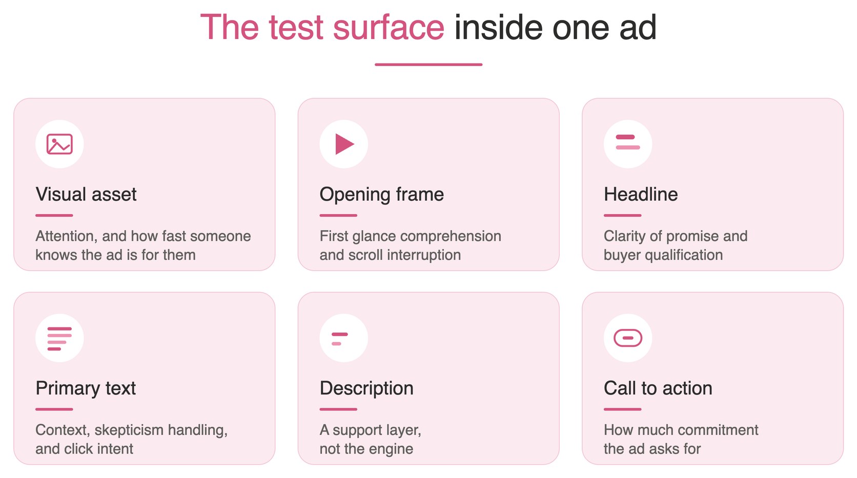
A performance shift rarely belongs to "the video" alone. The lift might come from a clearer opening frame, more believable primary text, or a better match between the ask and the buyer's state of mind. Collapse all of that into one verdict and the next round gets less precise.
What do Meta and TikTok actually publish about the front of the ad?
Most spec advice circulating about paid social comes from agency blogs rather than the platforms. It is worth going to the source, because the real guidance is narrower than the folklore.
For Facebook Feed image ads, Meta recommends 50 to 150 characters of primary text and a headline around 27 characters, at 1440 x 1800 in a 4:5 ratio (Meta ads guide). That is the paid spec: organic posts run on a lower ceiling, covered in the Instagram post size guide. TikTok is more specific about time than pixels: introduce the content proposition in the first 3 seconds, prioritise the hook inside the first 6 seconds, and keep text overlays around 5 to 10 words per second (TikTok creative best practices).
What this means for a DTC brand: the platforms are telling you the front of the ad is the ad. Neither publishes a magic aspect ratio that fixes a soft opening, and neither publishes a refresh cadence, so be suspicious of any article that attributes one to them.
That is also why the copy and the opening frame are one job rather than two. The first line is doing the same work as the first shot, and if they disagree the feed resolves the argument by scrolling.
Why do teams underestimate how many variables are live at once?
Because the ad is stored and discussed as a single file, which makes it easy to forget how many response levers are stacked inside it.
"We need three new videos" sounds small. "We need to test multiple message territories, several openings under each, one proof order change, and copy that frames the concept in different buyer language" makes the real workload visible.
This is also why review quality matters. If one ad wins, the team has to ask which layer caused the lift. The first frame? The proof order? The creator? A headline that finally made the promise clear? The ad may have improved because the concept was right, or simply because the concept became easier to understand. Teams thinking in terms of "the video" tend to make two planning mistakes: they under scope the variation needed to learn anything, and they over credit the broad concept when a narrow execution detail did the work.
How do you test angles instead of executions?
Most accounts waste money because they run one ad per angle and call it a learning. If that version wins you still do not know whether the result came from the idea, the hook, the proof, or the format.
The cleaner model treats the angle as the unit of testing and varies the execution underneath it. One angle should support multiple hooks and multiple formats, which is the only way to separate concept value from presentation value.
How should you cluster territory before making assets?
Cluster first so the team tests belief systems rather than random ideas. Group concepts by the kind of buyer tension they resolve, working from reviews, support transcripts, comment language, and post purchase surveys rather than a blank brainstorm. Our guide to competitor advertising research covers how to build that signal bank and how few live angles you actually need.
A practical clustering pass:
- Group recurring pains together.
- Separate objections from desires.
- Pull out mechanism beliefs that need proof.
- Split routine friction from outcome frustration.
- Keep identity driven angles separate from practical ones.
Two ideas can sound similar while asking the ad to do completely different work. "I want better results" and "I do not believe this will work for me" are not the same angle. One intensifies desire, the other removes resistance, and mixing them muddies the brief.
Before production starts the team should be able to answer one question cleanly: what belief is this angle trying to change or confirm? If that answer is vague, the test is not ready.
What do the three result patterns look like?
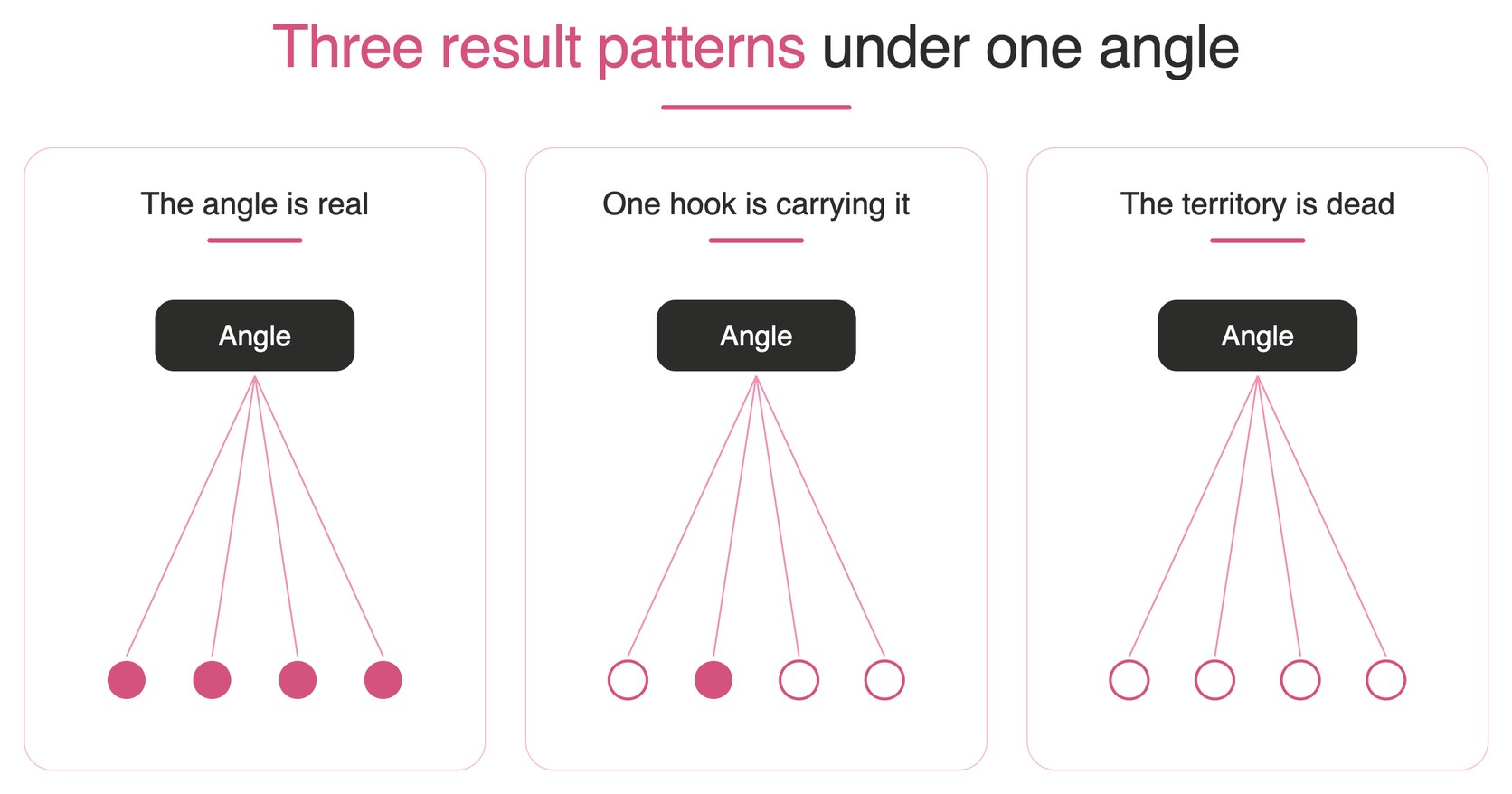
Take one angle: the buyer is interested in the category but doubts this specific product will work in their situation. The ad is not creating awareness, it is removing disbelief. Under it the team writes several hooks that all attack that doubt in different language. Then the results arrive in one of three shapes.
The angle is real. Several hooks hold up across more than one edit, and none looks like a lone outlier carrying the rest. The ads attract the right kind of click, the body keeps enough attention, and downstream efficiency does not collapse once curiosity wears off. The market cares about the territory. Expand it with more executions, more creators, or stronger proof.
One hook is carrying the angle. One opening clearly outperforms while the rest of the family underperforms. The strength may be coming from a specific phrasing style rather than the territory. Do not scale the angle blindly, test more versions of the winning hook logic and see whether it repeats.
The territory is dead. Every hook struggles even after changing edit structure, proof order, and creator delivery. Response never stabilises into commercial usefulness. Stop spending production effort there.
What happens when a team reads an execution win as an angle win?
It scales the wrong lesson. One ad performs, everyone assumes the territory is proven, and the next brief says "make more objection ads" without naming what actually repeated.
But the ad may have won for narrower reasons. The creator sounded unusually credible. The first frame made the product instantly legible. The proof arrived earlier. The copy used exact buyer language instead of category language. Those are execution advantages.
A safer review asks: did multiple hooks under this angle work or only one? Did the strength repeat across more than one edit? Was the lift visible with another creator, or only one voice? Did the result survive past the opening and stay commercially useful? If the answers are narrow, keep the lesson narrow.
How should you read the response beyond the click?
Click through rate alone is a weak judge of creative. A hook can earn curiosity and still attract the wrong buyer, which is why downstream performance matters more than surface engagement.
Ask layered questions instead. Did the opening create attention? Did the body turn that attention into understanding? Did the proof reduce doubt? Did the click intent match what the landing page was prepared to convert? Curiosity can flatter a weak offer, cheap clicks can flatter poor audience fit, and strong watch behaviour can flatter an ad that entertains without selling. Read only the top of the funnel and you will overproduce the wrong kind of creative.
How should the workflow change across TikTok, Reels and Stories?
The biggest difference between these placements is not strategy, it is workflow. The angle can stay the same while the way you brief it, shoot it, edit it, and review it changes. Ignore that and the same raw material gets pushed everywhere and underperforms for different reasons on each surface.
How should briefing change by placement?
For TikTok style creative the brief needs to give the creator room to sound like a real person. The message stays precise, the language stays lived in. Name the tension, name the proof, leave room for natural phrasing. Our TikTok ads best practices guide goes deeper on what the platform's own guidance asks for at the front of the video.
For Reels the brief benefits from more control over sequence. The creator can still sound natural, but the team needs stronger guidance on when the product becomes visible and how quickly the core claim gets anchored.
For Stories the brief should think in beats. Each segment needs a job: one names the problem, one introduces the product, one shows proof, one advances action. If the message only works watched as one uninterrupted flow, it is fragile.
Briefs should not just say what the ad is about. They should say how the message travels through the feed.
How should editing rhythm and review change?
TikTok style edits often benefit from preserving some roughness, because small pauses and natural reactions can read as credibility rather than sloppiness. Reels usually rewards stricter visual discipline, with the strongest proof hard to miss. Stories needs modular editing, where each beat is legible on its own while still contributing to the whole.
Review changes with it. On TikTok, check whether the ad sounds like a person rather than a script performance. On Reels, check whether the strongest claim lands before patience runs out. On Stories, check whether each segment earns the next one, because a viewer who enters midway still has to follow it. A single review checklist rarely works across all three, since the angle is shared but the failure modes are not.
What should you ask a creator for?
For TikTok style production, ask for multiple spoken takes, alternate phrasings, candid reactions, and moments that feel observed rather than staged. For Reels, ask for cleaner demonstrations, stronger product visibility, and deliberate coverage around the proof sequence. For Stories, ask for modular clips that can stand alone and be reordered without breaking the message.
The creator ask is part of strategy. Ask for the wrong raw material and no edit fully rescues the mismatch. It is also why reviewing in the placement matters more than reviewing in a mockup: a concept that looks clean in presentation mode can fall apart in feed if the proof is tiny or the hook is delayed. If you want the format decided before the edit starts, our TikTok creative strategy walkthrough covers that upstream step.
What makes a brief a creator could actually film?
A creator ready brief is a working document, not a mood board with notes. It tells the creator which angle to film, which objection to address, what proof to show, and what the ad has to do once it is live.
We use nine fields: objective, audience, single message, primary call to action, the metric that defines success, deliverables, placement intent, mandatory assets, and timeline. The fields matter less than whether each one removes an uncertainty. Our what an ad creative is page covers what those fields look like when they are filled from your own reviews and campaign data instead of written from a blank page.
Good answer versus empty answer, field by field
| Field | Good answer | Empty answer |
|---|---|---|
| Objective | "Prove that this product removes the buyer's main hesitation" | "Drive awareness" |
| Audience | "People already in the category who doubt this will fit their routine" | "Women who shop online" |
| Single message | "This works because it removes the step people usually avoid" | "Show the benefits and brand story" |
| Primary CTA | "Ask for the next step a skeptical buyer who still needs proof would take" | "Use a strong CTA" |
| Success metric | "Judge this on whether it attracts commercially useful traffic" | "Make it perform" |
| Deliverables | "Distinct variants that test different openings under the same angle" | "Send a few options" |
| Placement intent | "Built for the placements it will run in, so the message survives the crop" | "Make it work everywhere" |
| Mandatory assets | "Product in use, the proof moment, packaging, required claims" | "Use what you think looks best" |
| Timeline | "Film, edit, review and approve early enough that revisions can still improve the test" | "Need this soon" |
Every field should remove one avoidable uncertainty. If the creator still has to guess the angle, the proof, the audience mindset, the required scenes, and the review standard, the document is not a brief. It is a handoff of ambiguity.
What hook openings can a creator actually say?
A hook has to be speakable, not written for a deck. Three patterns that do strategic work while sounding like a person:
Confronting skepticism. "Honestly, I thought this was going to be one more thing I try once and forget about, but that is not what happened."
Opening on a result. "The first thing I noticed was that this part of my routine got way easier, and that is why I kept using it."
Opening on a common mistake. "I realised I was doing what most people do with this category, adding more steps when the real fix was making it simpler."
Each one tells the creator how to behave in the opening. One names doubt, one starts with a felt outcome, one begins with recognition.
How do you build win and kill logic into the brief?
Name what the test is meant to validate before production begins, so review stays on the learning question instead of drifting into preference. Win logic answers "what result pattern would make us produce more of this?" Kill logic answers "what failure pattern tells us to stop investing in this territory?"
That does two useful things beyond the obvious. It improves revision quality, because a team that knows the test was about proof sequence can preserve the angle and change only the proof. And it reduces wasted creator effort, because creators do better work when they know what must stay constant across takes and what can flex.
How do you set thresholds you can actually trust?
Creative diagnosis gets easier when you stop asking "is the ad working?" and start asking where the breakdown happened.
What does each signal diagnose?
| Signal | What it diagnoses | Where to look first |
|---|---|---|
| Hook rate | Whether the opening earns attention | First frame, first line, speed of comprehension |
| Hold rate | Whether the body sustains interest | Pacing, proof order, repetitive footage |
| Click through rate | Whether the framing creates action intent | Offer clarity, promise, the ask |
| Cost per acquisition | Whether acquisition is efficient | Buyer quality, qualification, landing page match |
| Return on ad spend | Whether the concept pays back | Economics, funnel role, whether the angle fits the margin |
Not every metric has to move for you to learn something. Sometimes the opening improves while downstream results stay flat, which means the ad got more attention without getting more convincing. Our post on hook rate versus hold rate covers how those two separate in practice.
How do you set thresholds from your own baseline?
Set them from your own recent history, not from a number in an article. Start with a sample of ads launched under comparable conditions and establish what normal has looked like lately for that account by format, audience quality, and funnel role. That is the working baseline.
Compare each new test against the recent norm for the same kind of creative. A cold audience direct response ad should not be judged against a retargeting ad, and a rough creator led test should not be judged against a polished brand asset with a different objective. Useful baselines come from like for like comparisons.
Then separate early directional signals from decision signals. Early signals tell you whether the opening is attracting attention or the body is collapsing. Decision signals tell you whether the ad deserves more budget, more variants, or retirement. Mix those together and you either kill ideas too fast or leave weak ones alive.
Define in advance what "better than normal," "roughly normal," and "worse than normal" mean for your account, using your own creative history. That gives the reviewer a frame before attachment to the asset starts rewriting the standard. It also keeps you out of the trap of importing someone else's refresh calendar: Meta publishes no frequency threshold, and a fixed rotation schedule either churns creative that still works or leaves a tired concept live another week. Our guide to ad fatigue works through that in detail.
When is a signal too new to act on?
When the ad has not had enough opportunity to show a stable pattern. Early data is useful for spotting obvious failure, but not every early move is a real move.
Act fastest on the metrics that stabilise earliest and more carefully on the ones that depend on longer buying cycles or fewer conversion events. The practical question is not "is there data yet?" It is "is there enough comparable behaviour to trust the pattern?" Look for confirmation across adjacent signals too. If hook rate and hold rate are both weak, the opening deserves immediate attention. If click intent looks soft while opening and body are healthy, look at framing, offer logic, or audience fit before reacting to one fresh datapoint.
What should you change when one signal breaks?
Change the narrowest likely cause first. That preserves learning and stops the team rebuilding the whole ad when one layer failed.
- Weak hook rate. The issue lives near the top. Does the viewer know what the ad is about quickly enough? Is the opening talking around the problem instead of naming it? Reshooting the whole piece is usually unnecessary.
- Weak hold rate. The opening is working while the middle fails to justify attention. Usually bloated explanation, weak proof order, or a body that sounds generic after a sharp hook. The fix is not "make it shorter," it is "make the middle earn its place."
- Weak click through with acceptable attention. The ad is understood without creating action intent. The message may be interesting but unpersuasive, or the ask may be bigger than the ad has earned.
- Healthy clicks, weak cost per acquisition. The problem sits downstream. The ad may be attracting the wrong buyer or oversimplifying the promise. A sharper filter often beats a broader promise.
- Weak return on ad spend. Think commercially. The concept may generate engagement without purchase value, or work only where the economics do not hold. The answer may be a more precise promise rather than a prettier ad.
When you do isolate a layer, generate three to five variants of that element only and hold everything else constant. Our creative diagnostics post covers the full win, iterate and kill call.
What does the week actually look like?
Give each block of work an owner and an output. That is what stops the system collapsing into a pile of half finished ideas.
| Day | Owner | Output |
|---|---|---|
| 1. Signal collection | Research or performance lead | Ranked list of tensions, plus what is worth retesting |
| 2. Angle selection | Strategy or performance lead | Shortlist of angles, each with the reason it earned the slot |
| 3. Briefs and hooks | Brief writer or copywriter | Creator ready documents with proof requirements |
| 4. Production assignment | Producer or creative ops | Clear ownership of who makes what by when |
| 5. First cut review | Editor plus reviewer | Focused revisions, not taste commentary |
| 6. Launch and labelling | Media buyer or performance owner | A test set that can still be interpreted later |
| 7. Early read and logging | Reviewer or performance lead | An orderly start to interpretation, not a verdict |
The calendar can shift. The ownership should not stay vague, because when everyone is involved in every stage nobody owns the quality of any stage.
A considered purchase week
Take an invented brand, Northline Sleep, selling a premium cooling mattress. The purchase is considered, so the challenge is not awareness. It is disbelief about whether the comfort claim is real.
The signal comes from review and comment mining: buyers like the promise of a cooling mattress but assume the category exaggerates, and that comfort claims are too abstract to trust from a short ad. The angle chosen is narrow. Not "luxury sleep" but people want cooling relief and doubt they will feel a meaningful difference night to night. That implies the proof: the ad cannot rely on mood, it needs footage and language that make relief concrete.
The hooks stay in that territory while differing in wording, from a direct objection opening to a result first opening to one built on the moment something stopped happening at night. The brief tells the creator to avoid broad luxury language, show the bedtime and wake up context, describe the before state in plain speech, and keep the proof lived in rather than polished. The editor builds a direct objection cut, a result first cut, and a routine based cut.
The response shape shows the direct objection and lived experience openings holding up across more than one edit, while the softer lifestyle opening attracts attention without moving commercial intent. That reads as pattern one with a caveat: the angle is real, but only when it stays close to disbelief and lived proof. The decision is to keep the angle, kill the luxury first framing, and brief a second round that sharpens proof rather than changing territory.
A repeat purchase week
Now Cinder and Bloom, selling a repeat purchase skincare product. Less considered, but sharper repetition pressure, so hooks have to refresh before the audience tunes out.
Reviews and support language show people are not confused about what the product is. They are frustrated that the category feels high effort and inconsistent. They want something they can stick with. The angle: the routine works better because it is easier to keep doing. That is not a transformation promise, it sells consistency by removing friction.
The brief tells the creator to avoid aspirational beauty language, shoot the routine in ordinary lighting, capture the exact step that usually gets skipped, and describe the relief of something feeling manageable. The editor builds a result first version, a routine friction version, and a mistake framing version.
The routine friction framing attracts the best fit buyer while the prettier transformation cut earns engagement without the same commercial strength. The angle is working, but only close to ease and repetition. The decision is to expand with more creator voices and keep the claim grounded in consistency, rather than moving on because one cut worked.
What carries forward and what gets thrown away?
The carry forward assets are not the winning files. They are the named angle territories, the hook families that showed repeat strength, the proof structures that improved belief, and the creator instructions that produced usable footage. Keep those, along with naming and notes that make past results easy to revisit. A structured library is what makes reuse possible, which our post on creative asset management covers.
Throw away vague concepts with no buyer belief behind them, one off wins that could not repeat under a second execution, lifestyle footage that looks good and proves nothing, review notes written in taste rather than diagnosis, and unlabelled asset clutter.
The point of the weekly cadence is not to make more ads. It is to keep the learning environment clean enough that production capacity stays pointed at ideas that still deserve it.
How Selzee runs this loop
Selzee is an AI content team for DTC brands, and this loop is the thing it is built around. It reads customer reviews, ad comments, ad account data, competitor ads, and the organic feed, then turns those signals into angles, briefs, test plans, and creator matches.
The useful part is not another dashboard. It is that the output is the next step: a named angle with the proof it needs, a brief a creator can film, and a verdict loop that says which territory earned another round. That is the part teams most often try to hold in their heads, and it is the first thing to break when output goes up.
FAQ
What is the difference between an angle and a hook?
An angle is the belief territory the ad is trying to change or confirm. A hook is the opening expression of that angle, usually the first line or first frame that earns attention. One angle should support several hooks.
How many angles should a DTC brand test at once?
Only as many as you can support with clear hooks and clean review. Spread across too many territories and execution quality drops while the learning gets too muddy to trust. A handful of live angles that each support several executions beats a long list nobody briefs properly.
How do you know whether an ad lost because of the hook or the offer?
Look for where the response breaks first. If the opening fails to earn attention relative to your account's recent norm, the hook is the likely problem. If attention is fine but action intent stays weak, look at the offer framing, the proof, and the ask.
How many versions of one concept should you make before killing it?
Enough to separate the angle from the execution. If only one opening ever works and nothing else under the same territory holds up, the lesson is narrower than the team hoped, and the thing to test again is the hook logic rather than the whole angle.
Should the same ad run on TikTok, Reels and Stories?
The same angle can run across all three, but the workflow should change. Briefing, editing rhythm, review standard, and creator ask all adapt to how each surface is actually consumed.
When should you refresh creative instead of optimising the current ad?
Refresh when new edits stop restoring commercial usefulness. If the core concept still has strength, optimise within it first. If the territory itself looks tired, move to a new angle rather than waiting for a calendar date.
Ad creative design stops being a design problem the moment you treat it as a testing system. If you want that system running without adding manual overhead, see how Selzee turns customer signals into briefs, test plans, and creator matches.