

Let's get straight to the point. Mcommerce is any sale you make through a mobile device. For a Shopify merchant, this isn't a trend—it's your primary battleground. It's where the majority of your traffic is, and it holds the biggest key to unlocking more revenue. If your mobile experience isn't converting, you're leaving a staggering amount of money on the table.
What Is Mcommerce and Why It Demands a New Strategy
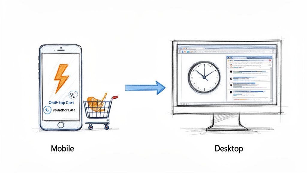
You're already running a successful ecommerce store. Don't fall into the common trap of thinking mcommerce is just your desktop site on a smaller screen. It's a completely different environment with a unique set of rules.
Your mobile shoppers aren't sitting at a desk, leisurely comparing tabs. They're waiting for a train, standing in line for coffee, or multitasking on the couch. They make split-second decisions in stolen moments.
This environment is fueled by impatience and an absolute demand for a seamless experience. The slightest friction—a slow-loading page, a clunky menu, a confusing checkout field—doesn't just irritate them. It sends them to a competitor, costing you the sale. They have zero time to hunt for the "add to cart" button.
The Critical Mindset Shift: From Responsive to Optimized
One of the most expensive mistakes Shopify merchants make is assuming their responsive theme is enough. A site that just works on a phone is a universe away from one that’s truly optimized to sell on a phone. To win in mcommerce, you must fundamentally change how you view the customer's journey.
Your focus must shift from designing for a patient, mouse-clicking browser to a distracted, thumb-tapping shopper who wants to get things done now.
Mcommerce is where customer intent is highest and patience is lowest. The brands that win are those that ruthlessly eliminate friction between discovery and purchase, making it faster to buy than to second-guess.
Put every part of your store under a mobile-first microscope. This means prioritizing speed above all else, designing navigation for one-handed use, and making your checkout so smooth it feels automatic.
Desktop Ecommerce vs Mobile Mcommerce: A Merchant's Mindset Shift
This table contrasts the traditional desktop shopping environment with the fast-paced reality of mcommerce, helping you quickly grasp the strategic adjustments needed for your Shopify store.
| Attribute | Traditional Ecommerce (Desktop) | Modern Mcommerce (Mobile) |
|---|---|---|
| User Context | Focused, research-oriented browsing sessions. | Distracted, on-the-go, and goal-oriented. |
| Session Length | Longer, often involving multiple product comparisons. | Short, rapid "micro-moments" to find and buy. |
| Primary Input | Precise clicks with a mouse and keyboard typing. | Imprecise taps with a thumb, minimal typing desired. |
| Conversion Factor | Detailed product information and trust signals. | Speed, simplicity, and a one-tap checkout. |
| Merchant Goal | Provide comprehensive information to build confidence. | Remove all possible friction to enable an instant sale. |
See the difference? It’s not about shrinking features; it's about sharpening them for an entirely different mission. Getting this right is how you stop losing mobile customers and start turning them into loyal buyers.
Why Mobile Is Now Your Primary Sales Channel
Let's be clear: your mobile site isn’t just a smaller version of your desktop store. For your customers, it’s the new flagship. A clunky, slow, or confusing mobile experience is no longer a minor hiccup—it’s the digital equivalent of a broken front door at your busiest retail location.
This shift is driven by how people now discover, research, and buy in what are called "micro-moments." These are the intent-packed windows of time when someone grabs their phone to act on a need—to learn, find, or buy something right now.
Think about it: a customer sees an ad on Instagram while waiting for coffee, looks up a product review on the bus, and completes the purchase while watching a show. These are the moments where your store absolutely has to perform flawlessly.
The Real Cost of a Poor Mobile Experience
Failing during these micro-moments is incredibly expensive. Mobile users have zero patience. If your site takes more than a few seconds to load, or if they can’t find what they’re looking for with a few taps, they won't try again later on a computer. They’ll bounce and buy from a competitor whose mobile store actually works.
For a Shopify merchant, every extra second of load time and every unnecessary click is directly tied to lost sales. A mobile-first strategy isn't a design trend; it's a fundamental business decision that impacts your bottom line.
This goes beyond just looking good on a small screen. It's about leveraging the ease of modern mobile payments. Customers are now conditioned by Shop Pay, Apple Pay, and Google Pay to expect a one-tap checkout. If your store forces them to manually type in their shipping address and credit card info, you're creating friction that murders your conversion rates.
The Staggering Numbers Behind the Mobile Takeover
The data tells a story that's impossible for any serious merchant to ignore. By 2025, global mcommerce sales are projected to hit between $2.5 trillion and $6 trillion—accounting for around 59% of all online retail sales.
With 1.65 billion people—30% of all internet users—actively shopping on their phones, the desktop is no longer king.
This trend creates huge opportunities for stores that get it right and poses existential risks for those who lag behind. The brands seeing explosive growth are the ones that have embraced this new reality. To see how optimizing the mobile journey translates into real-world revenue, review these case studies from stores that have successfully made the leap.
The takeaway is urgent: your mobile site is your primary sales channel, your main customer touchpoint, and the single biggest factor in your store’s future growth. Prioritizing mcommerce isn't just a smart move; it’s a survival imperative.
Revenue-Killing Mcommerce Mistakes Shopify Stores Make
Your mobile store is your new flagship location. Unfortunately, for too many Shopify merchants, it's also where profits go to die. We aren't talking about minor design flaws; we're talking about specific, expensive mistakes that actively push paying customers away every single day.
Let's dive into the most common conversion killers plaguing Shopify stores and how to fix them.
The $35,000 One-Second Mistake
The biggest error is treating mobile speed as an optional upgrade. It’s not. A delay of just one second in page load time can slash conversions by 7%.
For a store earning $500,000 a year, that's a potential $35,000 loss from a single second of lag. This is a direct, self-imposed tax on your revenue. A primary cause is uploading massive, unoptimized product photos straight from your photographer. They look incredible on a 27-inch monitor but destroy loading speeds on a 4G connection, causing shoppers to bounce before your page even loads.
Navigation That Fights the Thumb
Next is navigation that wasn't built for thumbs. Many themes simply shrink the complex, multi-level desktop menu. This forces customers into a frustrating game of pinch-and-zoom, trying to accurately tap tiny text links. It's a recipe for rage-quitting.
Your mobile navigation must be ruthlessly simple. A shopper should find what they want in three taps or less. If they have to wrestle with a confusing menu or a search bar that returns irrelevant results, they will leave and buy from a competitor who has already solved this.
A mobile user's thumb is your new mouse cursor, but it's far less precise and far less patient. Forcing them to navigate a menu designed for a desktop is like asking them to thread a needle while jogging—it's an impossible task that only leads to frustration and failure.
This extends to product filters. A desktop-style sidebar packed with tiny checkboxes is a mobile user's nightmare. It clutters the screen and creates excessive work for someone who just wants to buy.
The Checkout Gauntlet
Perhaps the most painful mistake is a checkout process that feels like filling out tax forms. Every single field you ask a mobile user to type into is another opportunity for them to abandon their cart.
You've done the hard work: they found a product, added it to their cart, and are ready to pay. Then, you hit them with a wall of tiny fields on a cramped keyboard. It's a massive momentum killer.
It's astonishing how many Shopify merchants let simple UX friction sabotage sales at the finish line. Below are the most common offenders costing stores real money. We’ve laid out the mistake, explained why it’s costing you, and given you the exact fix.
Mobile Conversion Killers and How to Fix Them
| The Mistake | Why It Costs You Money | The Fix |
|---|---|---|
| Forcing Account Creation | It's the #1 reason for cart abandonment. Shoppers see it as a huge, unnecessary barrier to purchase. | Enable guest checkout and make it the default, most prominent option. Let them create an account after the sale. |
| No One-Tap Payment Options | You're forcing users to manually type in 16-digit card numbers and addresses. It's slow and prone to errors. | Integrate Shop Pay, Apple Pay, and Google Pay. These wallets turn a multi-step process into a single tap or look. |
| Too Many Form Fields | Every field adds friction. Asking for a "Company Name" or a separate "Apt/Suite" field creates work. | Audit your checkout ruthlessly. Remove every single field that isn't absolutely essential for shipping the order. |
| Vague Error Messages | "Invalid Input" without highlighting the problem field is infuriating. It makes users feel stuck and helpless. | Ensure your theme uses clear, specific error handling that instantly highlights the exact field with the mistake. |
Each of these errors creates an obstacle course between your customer's intent to buy and your "Thank You" page. Your goal is to make buying easier than leaving. Fixing these issues isn't just about good design—it’s about plugging the holes that are actively draining your revenue.
How to Optimize Your Store for Mobile Conversions
Having a "mobile-friendly" site is the absolute bare minimum. To actually make money from mobile shoppers, you need to turn your site into a mobile-optimized revenue engine.
This means ditching the habit of simply shrinking your desktop site. True mobile optimization is a complete rethinking of the shopping journey, designed specifically for the thumb. Every element must be viewed through the eyes of a busy, distracted shopper with zero patience for a clunky experience.
The goal is simple: eliminate every single point of friction.
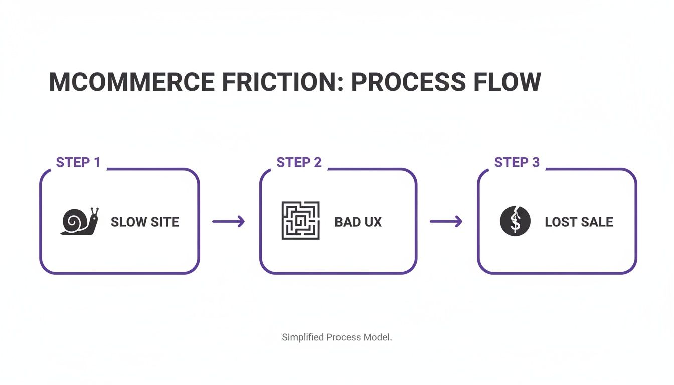
This diagram shows the vicious cycle of mobile commerce failure: a slow site leads to a terrible user experience, which leads directly to lost sales. Understanding this is the first step to building a mobile store that actually converts.
Redesigning for the Thumb-First Experience
Your mobile store is controlled almost entirely by a thumb. That single fact should guide every design decision. Tiny buttons, complex menus, and crammed links guarantee lost sales.
Make CTAs Sticky: Your "Add to Cart" or "Buy Now" button should be impossible to miss. A sticky header or footer keeps the main call-to-action in sight at all times, so a customer never has to scroll to find it. This one tweak can significantly increase your add-to-cart rate.
Simplify Navigation (Radically): Forget giant, multi-level desktop menus. On mobile, navigation needs to be clean, with large, easy-to-tap targets. Feature your best-selling categories prominently and hide everything else behind a simple menu icon.
Design for One-Handed Use: Most people scroll with one hand, making the center and bottom of the screen prime real estate. Place your most important interactive elements—like navigation and CTAs—in this "thumb zone" for effortless access.
Eliminating Checkout Friction
The mobile checkout is a graveyard of abandoned carts. Every extra field and every additional tap dramatically increases the chance of abandonment. Your mission is to make giving you money the easiest thing they do all day.
Your mobile checkout shouldn't feel like filling out a form; it should feel like a quick confirmation.
The second a customer decides to buy, your job is to get out of their way.
To truly optimize, it helps to brush up on mobile payment expertise to ensure your backend is as slick as your frontend. And how do you know if your changes are working? You measure. Use a conversion rate calculator to track your progress and see the impact of every optimization.
Turning Search into a Conversation
One of the biggest frustrations in mcommerce is product discovery. Forcing shoppers to pinch-to-zoom and wrestle with clunky filter sidebars is a recipe for disaster. This is where modern tech provides a massive competitive edge.
Instead of making customers do all the work, meet them with conversational AI.
An AI shopping assistant like Selzee completely solves the product discovery problem. It lets shoppers type or say what they want in plain English. A search like, "show me red summer dresses under $75," instantly bypasses all clumsy menus and filters.
You turn a frustrating hunt into a helpful, easy conversation that leads the customer directly to the perfect product. This single change can transform the entire mobile experience from a chore into a guided journey that ends in a sale.
The Future of M-Commerce: AI and Personalization
The next breakthrough in mcommerce isn't a new theme or button color. The real revenue is in creating deeply personal, one-to-one shopping experiences at scale. The brands that will dominate are mastering AI-driven personalization, turning generic mobile storefronts into dynamic, personal shopping journeys for every visitor.
This isn't a distant, sci-fi concept. It's happening now. Top-tier brands are using AI to provide the kind of curated, conversational guidance you’d expect from a high-end physical boutique. This is a massive shift from just fixing what’s broken to actively anticipating what a customer needs before they even ask.
The growth numbers are staggering. Mcommerce sales are exploding from $2.16 trillion in 2023 to a projected $2.52 trillion by 2025, and are on track to blow past $3.44 trillion by 2027. A huge driver is social commerce, which already hit $699.4 billion in 2024 and sees conversion rates up to 10 times higher than traditional e-commerce.
From Clunky Search Bars to Smart Conversations
The old way of finding products on a phone is broken. Forcing customers to wrestle with a clumsy search bar and tap through endless filter menus is a fantastic way to make them leave. AI completely flips this, turning frustrating searches into helpful conversations.
Imagine a customer landing on your store. Instead of hunting, they can just ask, "I need a waterproof jacket for hiking that’s under $200 and comes in black." An AI-powered assistant understands instantly, serving up the perfect products just like a seasoned sales associate.
This conversational approach does more than just find products. It builds a guided experience that makes shoppers feel confident, which naturally leads to higher average order values.
The Dawn of Hyper-Personalization
AI allows you to go deeper than basic product recommendations. It analyzes browsing behavior, past purchases, and even real-time chats to build a unique storefront for every user.
This means the products they see, the offers they get, and the content they read are all tailored specifically to them.
- Predictive Recommendations: AI can anticipate a customer's needs, proactively suggesting the perfect accessory for an item in their cart or new arrivals they're almost guaranteed to love.
- Dynamic Offers: Automatically flash a special discount to a first-time visitor or create an exclusive bundle for a loyal customer on the fly.
- Personalized Content: From the homepage banner to product descriptions, AI can tweak messaging to connect with different shopper profiles.
The future of mcommerce isn't about having a mobile site; it's about delivering a million different mobile sites, each one perfectly tailored to the individual shopper interacting with it at that very moment.
AI as Your 24/7 Sales and Support Crew
For a busy Shopify merchant, the operational benefits are just as compelling. Think of an AI shopping assistant as a tireless new team member who is always on, 24/7, handling frontline customer chats.
This tech can instantly manage questions from Instagram DMs, provide real-time help during a live shopping event, and answer common questions that used to consume your day. This frees up your human team to focus on high-impact tasks. For a powerful example, explore this case study on an AI beauty assistant that completely transformed a brand's customer experience.
By leveraging AI, you're not just tweaking a sales channel. You're building a smarter, more personal, and far more profitable mcommerce engine that works for you around the clock.
Shopify M-Commerce FAQ
You understand the stakes. Now let's get practical. Here are the direct, no-fluff answers to the most common questions from Shopify merchants who are serious about winning on mobile.
How Is M-Commerce Different From Regular E-Commerce for a Merchant?
Think of it this way: your e-commerce site is the sprawling department store. Mcommerce is your high-speed, high-energy pop-up shop in a busy train station.
While mcommerce is a subset of e-commerce, the customer's mindset is entirely different. A desktop user might have multiple tabs open, patiently comparing specs. Your mobile shopper is likely on a bus, waiting in line, or killing a few minutes on the couch. Their attention span is short, and they're using their thumb.
For a merchant, this means your mobile experience can't be a shrunken version of your desktop site. It demands a relentless focus on speed, simplicity, and a frictionless path from discovery to purchase. A clunky mobile checkout is a thousand times more likely to kill a sale than a desktop one because your user’s patience is near zero.
What Are the Key M-Commerce Metrics I Should Be Tracking?
Stop guessing and start measuring. The data is already in your Shopify Analytics. Segment your traffic by device to get a clear picture of where your mobile experience is failing.
These are the KPIs that tell the real story:
- Mobile Conversion Rate: If this number is significantly lower than your desktop rate, it's the ultimate red flag for your mobile store's health.
- Mobile Cart Abandonment Rate: A high rate here screams that your checkout process is broken. People want to buy but are hitting a wall.
- Mobile Site Speed: Use Google's PageSpeed Insights for an objective score. Every millisecond shaved off your load time directly translates into fewer bounces and more sales.
- Mobile Add-to-Cart Rate: This tells you if your product pages are compelling on a small screen and if the "Add to Cart" button is easy to find and tap.
- Mobile Average Order Value (AOV): Are mobile shoppers spending less per order? This could signal that your upsell and cross-sell prompts are poorly designed for the mobile view.
These metrics don’t just tell you that you have a problem—they pinpoint exactly where the leak is in your mobile sales funnel so you can fix it.
Is My Responsive Shopify Theme Enough for M-Commerce?
Let's be direct: a responsive theme is the absolute bare minimum. It's not a strategy; it's the price of entry. It ensures your site doesn't break on a phone, but it does not guarantee it’s optimized to convert. Think of it as the difference between a building being structurally sound and it being an inviting, brilliantly designed retail store people love to shop in.
True mcommerce optimization goes much deeper.
A responsive theme makes your desktop experience usable on mobile. A mobile-optimized experience makes it preferable.
This means rethinking navigation for thumbs, aggressively compressing images for instant loading, and stripping down forms to eliminate every unnecessary tap. A responsive theme might shrink a complex filter menu with 20 tiny checkboxes, making it technically work but a practical nightmare. A truly mobile-optimized experience would replace that menu entirely with a smarter, conversational search tool that makes finding products effortless.
If you're still exploring platforms, checking out the best CMS options for small businesses, including Shopify can provide a solid overview of how different systems handle mobile-readiness out of the box.
What Is the Fastest Way to Improve My M-Commerce Experience?
Want to see an immediate jump in mobile sales? Focus on the biggest friction points first.
Activate Every Accelerated Payment Option: This is non-negotiable. Go into your Shopify settings and enable Shop Pay, Apple Pay, and Google Pay right now. These wallets transform a painful typing exercise into a secure, single-tap confirmation, which can slash your cart abandonment rate.
Ruthlessly Audit Your Own Mobile Checkout: Grab your phone and try to buy something from your store. Be brutally honest. Is every field essential for shipping the order? If not, remove it.
Crush Your Image Sizes: High-res product photos are the number one killer of mobile site speed. Use a Shopify app or an online tool to compress your images without sacrificing quality. Speed is money on mobile.
Remove the Burden of Discovery: The most frustrating part of mobile shopping is trying to find what you want. Instead of forcing people to peck at tiny filter menus, give them a virtual sales associate.
An AI shopping assistant removes the friction of searching and browsing. It lets shoppers just say what they're looking for, guiding them directly to the perfect product and, ultimately, to a purchase.
This kind of effortless, conversational guidance is exactly what Selzee was built to do. It becomes your 24/7 mobile sales expert, turning frustrating searches into happy customers and transforming your mobile site into the revenue powerhouse it's meant to be. Learn more about how you can instantly upgrade your store's mobile experience at https://selzee.com.