You have traffic, but it's not converting. Every visitor who leaves without buying is a missed opportunity, and that lost revenue adds up fast. The key to fixing this isn't chasing trendy tactics; it's about systematically plugging the leaks in your sales funnel where potential customers are dropping off. This guide is for Shopify merchants who are past the basics and ready to make data-driven changes that directly impact their bottom line.
Find Where Your Store Is Leaking Money
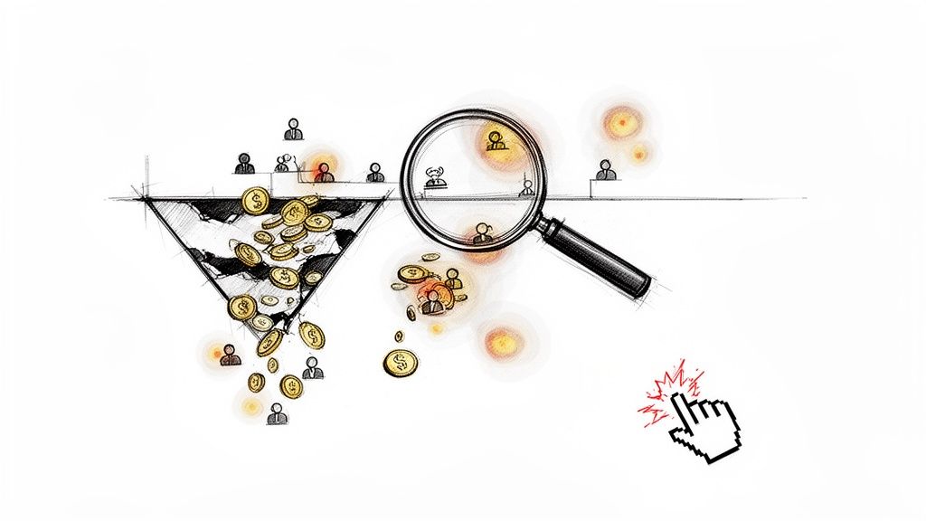
Before you A/B test a button color or rewrite a headline, you need to diagnose the problem. Your Shopify store is a goldmine of data, showing you exactly where customers get frustrated, confused, and ultimately, abandon their carts. Ignoring these clues is like trying to fix a leaky bucket without finding the holes—you'll waste time and money on changes that don't move the needle.
Your overall conversion rate is a vanity metric. A single number like "2.1%" tells you nothing about why the other 97.9% of visitors bailed. The real work is digging into user behavior to create a prioritized list of problems that are actually costing you money.
Go Beyond Surface-Level Analytics
Shopify Analytics tells you what happened, not why. To get inside your customers' heads, you need qualitative data. This is where you see how real people experience your site, and it’s often a wake-up call.
- Heatmaps: Tools like Hotjar or Microsoft Clarity create a visual map of your pages showing where people click, move their mouse, and how far they scroll. A heatmap might instantly reveal that everyone is clicking a non-linked image, highlighting an immediate design flaw.
- Session Recordings: This is the most powerful tool in your arsenal. Watch anonymized recordings of real user sessions. You’ll see them hesitate on a form, rage-click a broken button, or struggle to find your shipping policy. It's the closest you can get to seeing your store through a customer's eyes.
These tools expose friction points that raw numbers hide. A high bounce rate on a product page is just a statistic; watching five session recordings of users failing to find sizing information is a diagnosis you can act on.
Identify Your Biggest Conversion Killers
Armed with this data, hunt for the most common conversion killers. Don't try to fix everything at once. Focus on plugging the biggest, most expensive leaks in your funnel first.
Start your investigation on pages with the highest drop-off rates. If 70% of users who add a product to their cart never start the checkout process, you have a massive leak. Is a surprise shipping fee scaring them off? Is the "Checkout" button hard to find?
Navigation is another common culprit. Watch session recordings to see if people are getting lost. Are they clicking back and forth between category pages, unable to find what they're looking for? Confusing navigation sends them directly to your competitor.
The core principle is simple: every moment of confusion, frustration, or uncertainty for a shopper costs you money. Your first job is to find those moments and quantify the problem before you attempt to fix it.
To get a quick baseline, see how your numbers stack up. You can input your traffic and sales figures into a free tool to get a clear picture of your performance. For an easy calculation, use this ecommerce conversion rate calculator to see where you stand.
If you sell on marketplaces, a focused approach like an Amazon CRO strategy can be a game-changer for identifying and plugging conversion bottlenecks. The same principles of finding and fixing leaks apply, whether on your own site or a massive platform. When you combine hard numbers with real human insights, you build an evidence-based roadmap for every optimization you make.
Turn Product Pages Into Conversion Machines
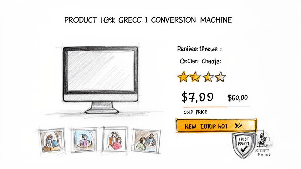
Your product page is where the sale is won or lost. This is where a browser decides to become a customer, and it's where most Shopify stores hemorrhage cash. Weak descriptions, unconvincing images, and a lack of trust signals create just enough hesitation to kill the sale.
Fixing this isn't about a massive redesign. It’s about making surgical changes that anticipate customer questions, eliminate their doubts, and make clicking "Add to Cart" a no-brainer.
Write Copy That Sells an Outcome, Not Just a Product
Nobody buys features; they buy the results those features create. Your product descriptions need to stop reading like a spec sheet and start painting a picture of a better future for your customer.
Stop using vague, meaningless words like "high-quality" or "premium." They are noise.
Instead, translate every feature into a tangible, real-world benefit.
Instead of: “Made with 100% organic cotton.”
Try: “Enjoy breathable, all-day comfort with fabric that’s incredibly soft on your skin and won't cause irritation.”
Instead of: “Advanced noise-canceling technology.”
Try: “Finally tune out the world and focus on your work or music, even in a chaotic coffee shop.”
This simple shift helps shoppers mentally "own" the product before they buy. Keep it scannable with short paragraphs, bullet points, and bold text. No one reads a wall of text, especially on mobile.
Build Unshakable Trust with Killer Visuals
In ecommerce, your photos and videos have to do the heavy lifting of an in-person sales pitch. They must replace the customer's ability to touch, feel, and inspect your product. If your visuals are blurry, generic, or sparse, it screams "unprofessional" and vaporizes trust.
Here’s your visual checklist for every product:
- Crystal-Clear Images: Show every angle—front, back, sides, and detailed close-ups of textures or key materials. Allow zooming without pixelation.
- Lifestyle & In-Context Shots: Show the product being used in a real-world setting. A backpack on someone's back gives a true sense of scale. Furniture in a styled room helps shoppers imagine it in their own home.
- Quick Demo Videos: A punchy 15-30 second video can answer more questions than ten paragraphs of text. Show off the star feature within the first five seconds to grab attention.
Great visuals don't just show the product; they prove its value and build the confidence needed to increase your ecommerce conversion rate.
Unleash Social Proof That Actually Persuades
Your marketing claims are biased. What your customers say about you is gospel. Social proof is one of the most powerful conversion tools you have, but just slapping a star rating on the page is lazy and ineffective.
The best social proof is specific, relatable, and packed with emotion. A generic “5-star review” is fine, but a review that says, “This face cream cleared up my stubborn acne in two weeks—I’ve never felt more confident!” is what actually closes the sale.
Make your social proof work harder:
- Spotlight Outcome-Driven Reviews: Find the most descriptive, benefit-focused reviews and pin them to the top.
- Showcase User-Generated Content (UGC): Nothing is more authentic than seeing real people enjoying your product. Feature customer photos and videos directly on your product pages.
- Let Shoppers Filter Reviews: Allow users to sort reviews by topics like "fit," "quality," or "shipping" so they can quickly find answers to their most pressing concerns.
This transforms reviews from a simple rating into a dynamic sales tool. It shows hesitant shoppers that people just like them have already bought—and loved—your product, making their own purchase decision feel safer.
Speaking of which, it's good to know where you stand. In 2025, global e-commerce conversion rates average between 2% and 4%, a huge leap from the 1.5%-2.5% we saw in the early 2000s. With mobile commerce set to hit a staggering $2.51 trillion, optimizing for phones is absolutely non-negotiable, especially since organic search traffic often converts at a healthy 4%. You can learn more about the evolution of ecommerce conversion rates on SpeedCommerce.com.
Nail the Final Step: Eliminate Friction from Your Checkout Process
You drove the traffic, your product pages are converting, and you earned that "Add to Cart" click. Don't fumble the ball on the one-yard line.
A clunky, confusing, or surprising checkout process is the number one reason high-intent shoppers bail. This isn't a small leak; it's a firehose of lost revenue. Your mission is to make giving you money the easiest thing they do all day.
Every extra field, every unexpected fee, every second a page takes to load—it's a tiny crack in their confidence. Enough cracks, and the sale crumbles.
The Non-Negotiables for a High-Converting Checkout
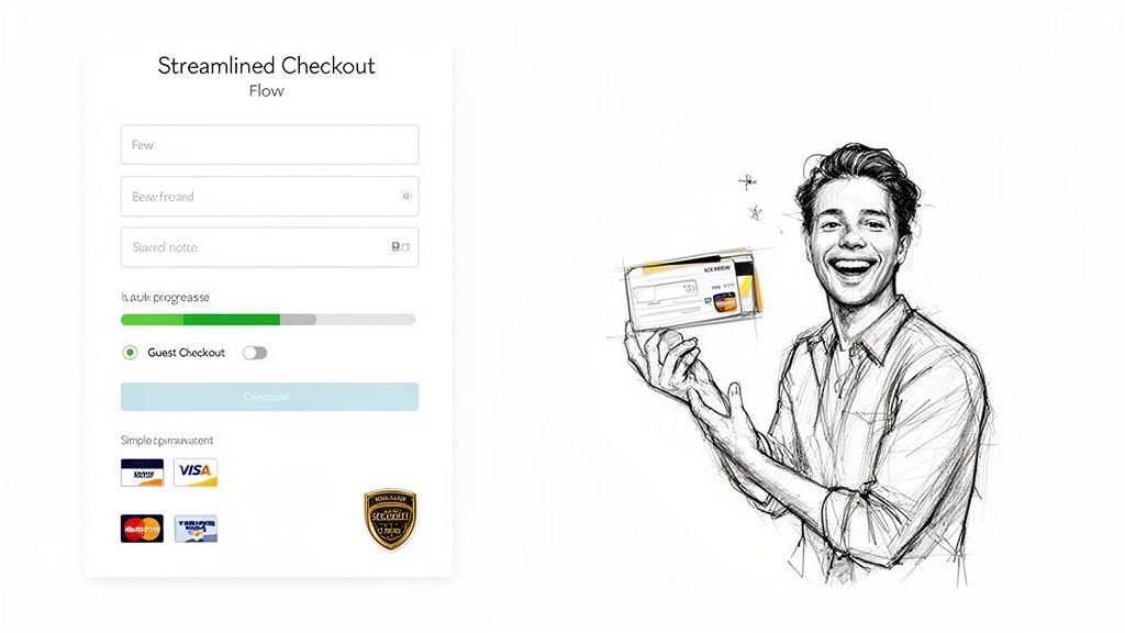
Forcing a customer to create an account before they can pay is a catastrophic, self-inflicted wound. In 2024, guest checkout isn't optional; it's the absolute baseline. Shoppers don't want another password and will bounce immediately if you make them register.
Equally important are express payment options. Integrating one-click solutions like Shop Pay, Apple Pay, and PayPal is one of the most powerful levers you can pull to increase your ecommerce conversion rate. They turn a tedious form into a single, secure tap.
Here’s your immediate to-do list:
- Activate Guest Checkout: If you haven't already, do it now. It shows you respect the customer's time and removes a massive psychological barrier.
- Feature Express Payments: Showcase them prominently at the start of the checkout flow.
- Add a Visual Progress Bar: Show shoppers exactly where they are in the process (e.g., Shipping > Payment > Review). It reduces anxiety and makes the journey feel faster.
These aren't "nice-to-haves." They are the core components of any modern checkout that converts.
Build Unshakeable Trust When It Matters Most
The checkout page is where customer anxiety peaks. They're about to hand over their credit card details, and any hint of sketchiness will send them running. This is your moment to triple-down on trust signals.
Display security badges (like SSL certificates and payment provider logos) where they can be seen. This isn't just window dressing; it's a visual promise that their data is secure. A simple lock icon next to the credit card field works wonders.
The most destructive checkout mistake is hitting your customer with surprise costs at the final step. All shipping fees, taxes, and handling charges must be calculated and displayed upfront—ideally on the cart page, before they start checking out.
A sudden, high shipping fee is the fastest way to shatter trust and earn an abandoned cart. Be radically transparent. If you offer free shipping, announce it clearly. If you have a threshold, gamify it with a dynamic bar: "You're only $15 away from free shipping!"
Streamline Your Forms, Field by Field
Finally, get ruthless. Scrutinize every single field you ask customers to fill out. Is it absolutely essential to fulfilling the order? The "Company Name" field is almost always useless for B2C stores. Do you really need their phone number if you aren’t using it for shipping updates?
Every optional field is another point of friction, another reason to quit.
This table breaks down the most common checkout killers and their solutions.
Common Checkout Friction Points and Their Solutions
| Friction Point | Impact on Conversion | How to Fix It |
|---|---|---|
| Forced Account Creation | Catastrophic drop-off (up to 23% abandonment) | Enable guest checkout immediately. It's a non-negotiable standard. |
| Surprise Shipping Costs | The #1 reason for cart abandonment | Use a shipping calculator in the cart. Offer free shipping thresholds. |
| Long, Complicated Forms | High cognitive load, leading to frustration and errors | Remove all non-essential fields. Use auto-fill and address lookup APIs. |
| Lack of Payment Options | Customer can't pay how they want | Integrate major digital wallets like Shop Pay, Apple Pay, PayPal, and Google Pay. |
| No Visible Trust Seals | Raises security concerns and anxiety | Prominently display SSL certificates and logos of accepted payment methods. |
| Slow Page Load Speed | Every second of delay decreases conversions by 7% | Optimize images, use a CDN, and ensure your checkout is mobile-first. |
By addressing these points, you directly attack the root causes of checkout abandonment. Your goal is to remove every obstacle between your customer's intent and a completed purchase. Make it fast, clear, and easy.
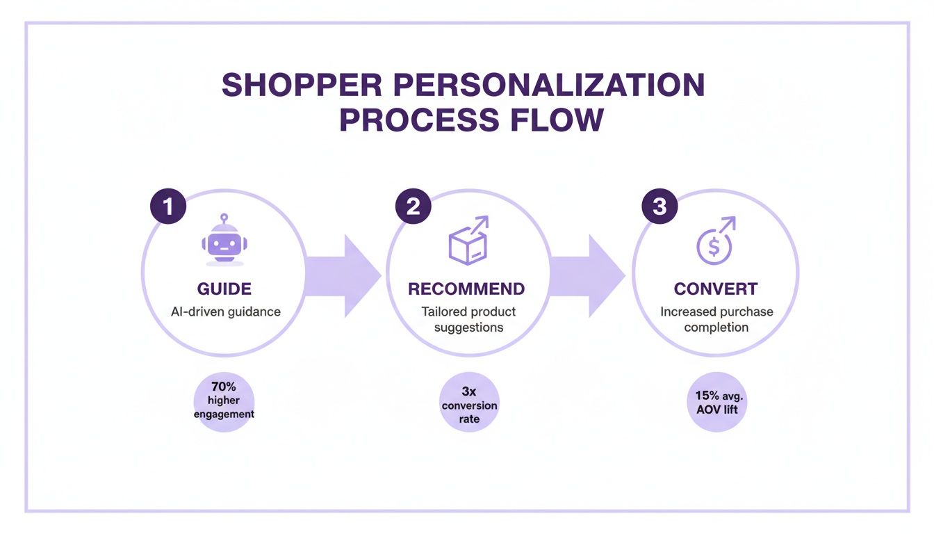
Use AI and Personalization to Guide Shoppers
The generic, one-size-fits-all store is dead. Customers expect you to know them, anticipate their needs, and guide them to the perfect product without making them do all the work. This isn't about being creepy; it's about using smart tools to create a helpful, guided shopping experience.
When every visitor gets the same treatment, you're leaving money on the table. The goal is to turn your static product catalog into a dynamic, one-on-one conversation that makes buying from you feel effortless. Get this right, and you’ll see both your conversion rate and your average order value climb.
Ditch Generic Calls-to-Action
Personalized calls-to-action (CTAs) demolish generic ones. Data shows that personalized CTAs can deliver a staggering 202% better performance. For DTC brands in beauty, nutrition, or electronics, that's a massive competitive edge.
A generic button screaming "Shop Now!" at every visitor is just noise. It’s easy for shoppers to ignore.
Now, imagine a visitor has clicked on three different vegan protein powders. Instead of that boring CTA, they see a message that says, “Find Your Perfect Plant-Based Fuel.” That small tweak shows you were paying attention and speaks directly to their goal. It connects.
The secret is tailoring your messaging to user behavior. While add-to-cart rates hover around 12%, a shocking 71.3% of those carts are abandoned—and that number balloons to 77.2% on mobile. Personalization is your best weapon here, letting you tackle a shopper's specific hesitations before they leave. If you want to dive deeper into these numbers, check out the latest conversion rate insights on Landbase.com.
Deploy an AI Sales Assistant That Works 24/7
What if you could give every visitor an expert salesperson, 24/7? Someone who could answer questions on the spot, recommend the perfect add-on, or offer a smart discount to a shopper who’s about to bail. That's exactly what AI-powered shopping assistants do.
Think of it as cloning your best employee, infinitely.
These aren't clunky, old-school chatbots that just frustrate people. Modern AI assistants, like those from Selzee.com, can hold natural conversations and act as a genuine guide for your customers.
- Instant Answers, Fewer Support Tickets: A customer asks, “Are your face creams gluten-free?” The AI gives them the answer instantly. They don't have to dig through an FAQ page or leave your site.
- Intelligent Upsells & Cross-sells: A shopper adds a camera to their cart. The AI can chime in with, “Great choice! Most photographers pair this with our high-speed memory card and this protective case.” That feels like helpful advice, not a pushy sales pitch.
- Proactive Cart-Saving Offers: The AI can detect when a shopper is about to leave (exit-intent). As their cursor moves to close the tab, it can pop up with a personalized offer: “Leaving so soon? Here’s 10% off to complete your order today.” It's a surgical strike that saves a sale you would have otherwise lost.
By automating these high-touch interactions, you’re not just improving the customer experience. You're building a revenue-generating machine that works for you around the clock, turning passive browsers into engaged buyers.
Personalize the Entire Shopping Journey
Real personalization doesn't stop with a chat window. The data you get from these AI interactions can be used to customize the entire experience for returning customers.
Imagine a visitor previously asked the AI about hypoallergenic skincare. The next time they land on your site, your homepage banner could automatically feature your sensitive skin collection. The product recommendations they see are now curated based on their actual needs, not just generic bestsellers.
This creates a brilliant feedback loop where every interaction makes the next one smarter and more relevant. Your store learns and adapts to each shopper. To see how you can get started, check out some of the powerful personalization tools available on Selzee.com that are built to plug into your Shopify store. This is how you stop being just another store and become their store.
Build a System for Continuous Optimization
Increasing your conversion rate isn't a one-and-done project—it’s a continuous process. The most successful ecommerce brands treat their stores like laboratories. They're always testing, learning, and tweaking to discover what actually gets people to buy.
Without a system, you're just throwing ideas at the wall and hoping something sticks. That’s a surefire way to burn through your time and budget with little to show for it.
Building a simple but powerful Conversion Rate Optimization (CRO) engine is the final piece of the puzzle. It turns your gut feelings into a reliable process for growth, ensuring every change is backed by real data from your actual customers.
Prioritize Your Tests with an Impact vs. Effort Matrix
You will never run out of ideas for things to test. The challenge is figuring out what to test now. It's easy to get caught up chasing small wins, like fiddling with a button color, which feels productive but rarely moves the needle.
Focus your limited time and resources on the opportunities that will give you the biggest bang for your buck.
Use a simple Impact vs. Effort matrix. Before starting a test, map your ideas:
- High Impact, Low Effort: These are your quick wins. Think rewriting a confusing product headline, adding a trust badge to the checkout, or clarifying your shipping policy. Do these immediately.
- High Impact, High Effort: These are the game-changing projects. Think overhauling your product page template or integrating a personalization engine. Plan these out carefully.
- Low Impact, Low Effort: These are minor tweaks like changing font sizes or small copy edits. Tackle these when you have downtime, but don't let them distract you from bigger opportunities.
- Low Impact, High Effort: This is the danger zone—complex changes with a tiny potential return. Avoid these altogether.
This exercise forces you to think critically about the potential ROI of your efforts. It ensures you’re always working on something that can genuinely increase your ecommerce conversion rate.
Running Your First A/B Tests
A/B testing (or split testing) is the heart of any CRO system. It means showing two different versions of a page—Version A (your current page) and Version B (your new idea)—to different groups of visitors to see which one performs better. Tools like VWO or Google Optimize (through a Shopify integration) make this easy to set up.
Here’s a simple process to follow:
- Start with a Clear Hypothesis. Don’t just test random ideas. Your tests should be driven by data. For example: "Based on session recordings, users seem confused about shipping costs. I believe changing the 'Add to Bag' button to 'Buy Now & Get Free Shipping' will increase add-to-carts by making the value prop clearer."
- Test Only One Thing at a Time. This is the golden rule. If you change the headline, the button color, and the product image all at once, you'll have no idea which change made a difference. Isolate one significant variable per test.
- Let the Test Run Until It's Statistically Significant. Don't call a test after two days just because one version is slightly ahead. You need enough data to be confident in the results. Most testing tools will tell you when you've hit statistical significance, typically a 95% confidence level.
I've seen it a hundred times: a new variation looks like a massive winner in the first 48 hours, only for the original to pull ahead by the end of the week. Different days bring different traffic. Be patient and let the data speak.
This whole process of personalization—guiding shoppers with AI, recommending the perfect products, and making it easy for them to buy—is a fantastic example of a high-impact system you can build and constantly improve.
As you can see, when you turn your store into a helpful guide, you create a seamless path from discovery to checkout. That’s what this is all about.
Analyze, Learn, and Do It Again
Once a test is finished, the work isn't over. The real value comes from digging into why one version won. Did the new headline connect on an emotional level? Did that clearer call-to-action remove friction? These insights fuel your next round of hypotheses, creating a powerful cycle of continuous improvement.
Even a "failed" test is a win. It teaches you what doesn't work for your audience, saving you from rolling out a site-wide change that would have tanked your conversions. Document everything: the hypothesis, the results, and what you learned. Over time, this becomes one of your most valuable business assets.
If you’re looking for more ideas to plug into your testing plan, check out this practical guide to improve ecommerce conversion rates. Seeing how other successful brands do it can spark great ideas. And if you want to see what happens when a system like this is put into practice, take a look at these case studies that show how personalization can drive impressive lifts in conversion and average order value.
Your store’s conversion rate isn’t set in stone. It’s a direct result of the system you build. By consistently prioritizing, testing, and learning, you can turn optimization from a guessing game into your most reliable engine for growth.
Your Burning CRO Questions, Answered
Let's cut to the chase. When it comes to boosting your store's performance, you have questions. Here are the straight, no-fluff answers.
What’s a Good Shopify Conversion Rate, Really?
Everyone wants "the number," but a "good" conversion rate is a moving target. The industry average hovers between 1% and 3%, but that figure is almost useless without context.
If you're selling $500+ custom furniture, your conversion rate will naturally be lower than a shop selling $20 phone cases. The bigger the purchase, the longer the consideration period.
Stop chasing an arbitrary number and start benchmarking against yourself. If you’re at 1.5% this month, your goal is to hit 1.7% next month. That’s how you build a profitable business—through steady, relentless improvement.
Pro Tip: Once you consistently hit 3% or higher, you're in the top tier. You're outperforming most of your competition.
Ugh, Why Is My Conversion Rate So Low?
A low conversion rate is a red flag that something is creating friction or doubt for your shoppers. It's a symptom, not the disease. Before changing button colors, investigate these common conversion killers:
- Your Site is Slow: If your pages take more than three seconds to load, visitors are gone. They won't wait to see your products.
- Surprise Shipping Fees: This is the undisputed #1 reason people abandon carts. Hitting them with unexpected costs at the final step is a dealbreaker.
- Uninspired Product Pages: Are your photos blurry? Are your descriptions vague? A lack of glowing customer reviews? You’re not giving people the confidence they need to buy.
- A Complicated Checkout: Forcing account creation or making people fill out a long form is the fastest way to lose a sale you worked hard to get.
The bottom line is almost always a breakdown in trust or convenience. Your job is to find where things are going wrong. Use a tool like Hotjar and watch session recordings—it's a brutally honest window into your customers' minds.
Which Changes Actually Move the Needle?
Not all tweaks are created equal. To see a real impact on your bottom line, fast, focus your energy on the make-or-break moments in the customer journey.
- Overhaul Your Checkout: This is ground zero for lost sales. Enable guest checkout. Add express payment options like Shop Pay and PayPal. Removing this friction can give you a massive lift overnight.
- Level-Up Your Product Photography: Don't skimp here. Invest in a professional shoot. Show your product from every angle, in action, and in a context that helps the customer visualize it in their life. Great visuals do the heavy lifting for building trust.
- Nail Your "Above the Fold" Value Prop: The second someone lands on your page, they're asking, "What's in it for me?" You have about three seconds to answer that question. Make your core benefit impossible to miss without scrolling.
- Showcase Real Social Proof: Ditch generic star ratings. Feature photos from actual customers using your product. Highlight reviews that tell a story and focus on the outcome. A specific testimonial is a thousand times more powerful.
When you focus on these high-impact zones first, you're making strategic moves that lead to real growth.
To help you keep these key points in mind, here's a quick cheat sheet.
Quick Questions Answered
| Question | Short Answer |
|---|---|
| What's a good conversion rate? | Aim for 3% or more, but focus on consistently improving your own number. |
| Why are my conversions low? | Probably slow load times, surprise shipping costs, or a difficult checkout. |
| What's the #1 cart abandonment reason? | Unexpected shipping costs at checkout, without a doubt. |
| What's the fastest way to improve? | Simplify your checkout process with guest checkout and express pay options. |
| Where should I focus my budget? | On professional product photography and showcasing authentic social proof. |
Remember, this is all about finding and fixing the friction points that stand between a curious visitor and a happy customer.
Ready to turn more of your store's conversations into conversions? Selzee is an AI shopping assistant that acts as your best salesperson 24/7, providing instant answers, personalized recommendations, and proactive offers to guide shoppers to checkout. Learn more and see how Selzee can increase your ecommerce conversion rate at selzee.com.