Tired of pouring money into ads just to see your sales flatline? It's a common frustration, but the solution isn't more traffic. The key to growing your Shopify store is to stop chasing new visitors and start fixing the expensive leaks in your existing sales funnel.
It's about optimizing the customer journey. You need to pinpoint exactly where shoppers are dropping off and roll out targeted fixes to guide them smoothly toward the "Complete Purchase" button.
Find and Fix Your Conversion Rate Leaks
If you're getting clicks but not sales, your store is bleeding cash. Every visitor who leaves without buying is a missed opportunity and wasted ad spend. The first move in any smart conversion rate optimization (CRO) plan is to use your own data to find out where things are going wrong.
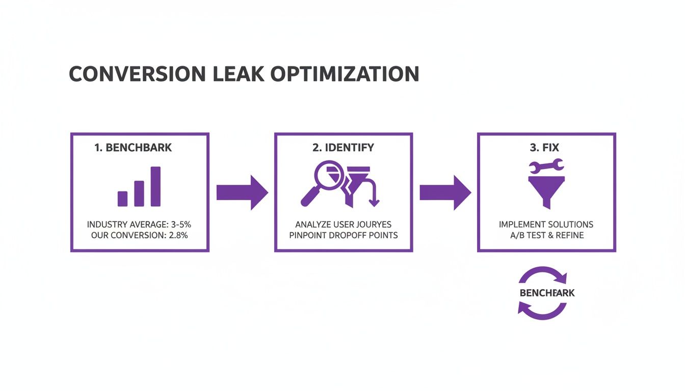
Before you can plug any holes, you need a benchmark. The global average for ecommerce hovers around a modest 1.9%. However, Shopify stores often perform better, averaging between 2.5% and 3%. The top-tier stores? They're crushing it with rates well above 3%. Knowing these benchmarks gives you a clear target.
Start Digging into Your Store's Analytics
Your Shopify analytics dashboard is a goldmine. Head over to Analytics > Reports > Online store conversion rate. This gives you the big-picture number, but the real story is buried a little deeper. The magic happens when you look at your conversion funnel report under Sales > Online store conversion funnel. This report breaks down the customer journey and shows you the drop-off between crucial stages:
- Reached checkout: This shows how many people who added items to their cart actually started the checkout. A huge dip here could mean your cart page is confusing or you're hitting people with unexpected shipping costs.
- Sessions converted: This is the finish line—the final number of people who completed a purchase. The gap between those who start checkout and those who finish is where you'll find issues like clunky payment options, forced account creation, or overly complicated forms.
Prioritize the Most Expensive Leaks
Not all leaks are created equal. A 50% drop-off from a product page to the cart is a problem, but a 50% drop-off from the checkout page to a completed sale is a catastrophe.
Your mission is to find the leaks that happen latest in the journey. Why? Because these shoppers have shown the most intent to buy. They've browsed, chosen a product, and added it to their cart.
A visitor who ditches their cart at the final payment step is a much hotter lead than someone who just bounced from your homepage. Fixing checkout friction will almost always deliver a bigger and faster return on your time than tweaking your homepage banner.
Quick Wins to Plug Your Leaks Now
Feeling overwhelmed? Don't be. Here are some high-impact, low-effort fixes to address the most common conversion blockers.
| Problem Area | Quick Fix | Why It Works |
|---|---|---|
| High Cart Abandonment | Add an "Exit-Intent" pop-up offering a small discount (e.g., 10% off) or free shipping. | Captures attention at the exact moment a user decides to leave, giving them a compelling reason to stay and complete their purchase. |
| Low Checkout Starts | Display shipping costs clearly on product pages or in a site-wide banner. | Surprise shipping fees are a top reason for abandonment. Transparency builds trust and eliminates nasty surprises. |
| Checkout Page Drop-Off | Enable guest checkout and offer multiple payment options like PayPal, Google Pay, or Apple Pay. | Reduces friction by removing the need to create an account and catering to the customer's preferred, trusted payment method. |
| Low Product Page to Cart | Add social proof like customer reviews, star ratings, and "bestseller" badges directly on the product page. | Builds confidence and trust. Shoppers are more likely to buy a product that others have already purchased and loved. |
Tackling even one of these common issues can make a noticeable difference in your numbers.
Once you have a handle on your current performance, play around with this free conversion rate calculator to see just how much revenue a small improvement could generate. For a deeper dive, check out these proven strategies to improve website conversion rates. By letting data guide your decisions, you can finally stop the guesswork and start making changes that actually grow your bottom line.
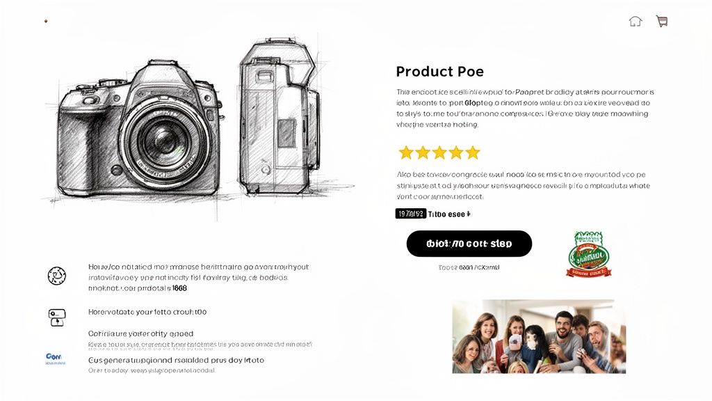
Turn Your Product Pages Into Conversion Engines
Let's be blunt: your product pages are your digital salespeople. If they aren't closing deals, you’re just running an expensive online catalog. Your Product Detail Page (PDP) is the final, critical pitch before a customer either commits or bounces for good. Every element must work together to build desire, squash doubts, and make saying "yes" a no-brainer.
This is where you stop talking about features and start selling outcomes. People don't buy a product; they buy a solution. A weak product page is a massive leak in your conversion funnel, and it's where you lose your highest-intent visitors.
Write Copy That Sells an Experience
Your product descriptions must do more than list specs. They need to paint a vivid picture of the end benefit. Your shoppers are scanners, not readers, so your value proposition has to hit them immediately.
- Lead with the benefit, not the feature. Instead of "100% organic cotton," try "Breathe easier with fabric that’s unbelievably soft on your skin."
- Use your customers' own words. Dive into your reviews and support tickets. What phrases do your happiest customers use? Mirror that language in your copy for an instant, authentic connection.
- Break up your text. No one reads a wall of words. Use bullet points, icons, and bold text to highlight must-know information. Make it effortless for someone to understand why they need your product in under five seconds.
Your job is to answer every question a potential customer might have before they have to ask. If they have to hunt for information on sizing, materials, or how to use the product, you’ve already created friction and lost momentum.
Make Your Visuals Your Best Sales Tool
In e-commerce, your product photos are the product until it arrives. Low-quality, single-angle shots scream "amateur hour" and obliterate trust. This is one area you cannot afford to skimp on.
- Show, don't just tell. You need multiple high-resolution photos from every angle—front, back, side, and close-ups of textures or key details.
- Provide context. Include lifestyle shots showing the product in use. If you sell a backpack, show it on a person to demonstrate scale. If it's furniture, place it in a styled room. This helps shoppers mentally "own" the product before they buy.
- Use video. A short 15-30 second video showing the product in action can be a game-changer. It answers functionality questions and builds a level of confidence that static images can't match.
Build Unshakeable Trust with Social Proof
Shoppers trust other shoppers infinitely more than they trust slick brand promises. Social proof is your weapon for cutting through skepticism and giving people the confidence to click "Add to Cart."
A classic mistake is just slapping a generic review app onto your site and calling it a day. The real magic is in strategic placement.
- Star ratings above the fold. This is an immediate, universally understood visual cue of quality. Make it impossible to miss.
- Highlight outcome-driven review snippets. Don't just show a generic five-star review. Pull out powerful quotes that describe a specific benefit, like, "This cream cleared up my skin in just two weeks!"
- Embrace User-Generated Content (UGC). Actively encourage customers to share photos of themselves using your product and feature them on the PDP. Seeing real people loving your stuff is far more persuasive than any polished studio shot.
- Show off your trust badges. Clearly visible logos for secure payments (like Shop Pay or PayPal) and any guarantees (e.g., "30-Day Money-Back Guarantee") are crucial for reducing last-minute hesitation.
Putting these tactics into play transforms a passive product page into an active, high-performing conversion machine. You can see how we've helped other Shopify stores apply these very principles to achieve massive growth in our collection of AI-driven ecommerce case studies.
Your Mobile Experience Is Costing You Money—Here’s How to Fix It
Let's be blunt: if your store isn't built for shoppers on their phones, you're practically throwing revenue in the trash. Ignoring the mobile experience is one of the most expensive mistakes an e-commerce brand can make today.
The equation is simple and brutal. More than half your traffic is probably coming from mobile, and those visitors are far less likely to buy.
This isn't a small hiccup; it's a massive conversion gap. Recent benchmarks show mobile conversion rates hovering around 1.8%, while desktop cruises along at 3.9%. Even though mobile sessions make up over 50% of all visits, they convert at less than half the rate. Why? Slow load times, microscopic buttons, and clunky checkouts are killing impulse buys. You can see the eye-opening picture in the latest device conversion data.
The goal isn't just a site that "works" on mobile. The goal is a seamless, frustration-free experience that turns mobile browsers into paying customers. It's time to capture the sales you're currently fumbling.
Find Your Mobile Friction Points
Before you start changing your theme, you need to feel what your customers feel. Get out your own phone—don't just use your computer's theme preview—and walk through the entire buying journey, from landing page to "complete purchase."
Be brutally honest with yourself.
- How fast is it, really? Test your site on a standard 4G or 5G connection, not your blazing-fast office Wi-Fi. Every second of delay is a customer lost.
- Can you get around easily? Is the search bar obvious? Is the menu a cluttered nightmare? Can you actually use the product filters on a small screen?
- Are your buttons "fat-finger-proof"? Tap targets are a huge deal. If someone tries to tap "Add to Cart" and accidentally hits the "size guide" link, that's pure frustration.
- Is filling out forms a pain? How annoying is it to enter an address? Are you forcing people to pinch and zoom just to type in their credit card number?
The "thumb zone" is real. Think about how someone holds their phone one-handed. Key buttons—especially "Add to Cart" and "Proceed to Checkout"—must be where their thumb can easily reach. If a customer has to shift their grip to buy, you've made it too hard.
High-Impact Mobile Fixes to Implement Now
Once you've felt the pain, fix it. These aren't massive redesign projects. They are targeted adjustments that solve the exact reasons people ditch their carts on mobile.
Get Your Site Speed Up
Mobile shoppers have zero patience. If your site takes more than three seconds to load, a huge chunk of your potential customers are gone.
- Crush Your Images: This is the easiest win. Use a Shopify app like Crush.pics or TinyIMG to automatically compress your product and theme images. They'll look just as good but load much faster.
- Ditch Useless Apps: Every app you install adds code that can slow your store down. Go through your app list. If you're not actively using it or it's not making you money, uninstall it.
- Pick a Fast Theme: If you're on a clunky, old theme, it might be time for an upgrade. Modern, performance-focused themes from the Shopify Theme Store (like the free Dawn theme) are built for speed from the ground up.
Make Navigation and Checkout a Breeze
On mobile, the path to purchase must be dead simple and lightning-fast. Your job is to remove every obstacle between your customer and their credit card.
- Make "Add to Cart" Sticky: Nothing is worse than scrolling down a long product page, deciding to buy, and then having to scroll all the way back up to find the button. A "sticky" Add to Cart button that stays fixed at the top or bottom of the screen is a game-changer.
- One-Click Payments are Non-Negotiable: Enable express checkout options like Shop Pay, Apple Pay, and Google Pay. These let people check out in seconds, completely skipping the tedious process of typing in their address and card details. It’s the closest thing to a magic wand for conversions.
- Rethink Your Forms: Design your forms for thumbs, not mice. Use single-column layouts, big fonts, and clearly labeled fields that work well with browser autofill. Make it painless.
By hunting down and fixing these mobile-specific conversion killers, you can start closing that revenue gap and turn your biggest source of traffic into your biggest driver of growth.
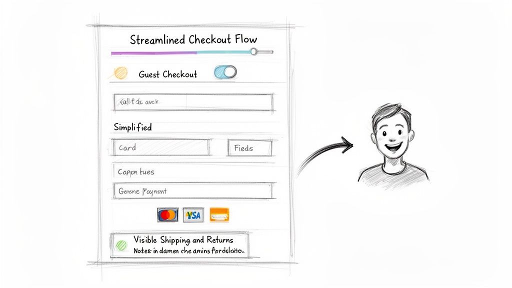
Make Your Checkout Frictionless—This is Where Sales Are Won or Lost
You got them to the checkout page. That’s a massive victory, but this isn't the finish line. This is the final, most crucial moment in your funnel, and it’s where an astonishing number of sales vanish.
Every field, every click, every unexpected pop-up creates friction. And friction gives your customer a reason to hesitate, second-guess, and abandon their cart.
Think of your checkout as the final handshake of a deal. If it's clunky, confusing, or asks for too much information, the whole thing falls apart. The goal is to make the process so smooth and trustworthy that hitting "Complete Purchase" feels like the most natural next step.
Take Apart the 3 Biggest Checkout Conversion Killers
Your shoppers are seconds away from giving you their money. Don’t give them any reason to bail. The most common checkout mistakes are always the most expensive, and they almost always come down to the same three culprits: surprise costs, forced commitments, and complexity.
Surprise Shipping Costs: This is the undisputed champion of cart abandonment. When you slap a customer with a surprise shipping fee at the last second, it feels like a cheap shot. Trust instantly evaporates, and they're gone. The fix is simple: show shipping costs early, either on the product page or in a clear site-wide banner.
Forcing Account Creation: Who wants another password to remember? Forcing a new customer to create an account just to buy something is a huge hurdle. It adds extra steps and a level of commitment they aren't ready for. You must offer a big, bold guest checkout option. You can always ask them to create an account on the "Thank You" page after the sale.
Clunky, Confusing Forms: We’ve all been there. Long, multi-page forms with tiny text fields are a headache on desktop and a non-starter on mobile. Every field you add is another reason for someone to give up. Your checkout form needs to be a masterpiece of efficiency. Stick to a single-column layout, ensure browser autofill works perfectly, and only ask for what you absolutely need to fulfill the order.
How to Build a Checkout That Inspires Trust and Action
Once you've cleared out those major roadblocks, it's time to proactively build confidence. A great checkout doesn't just work; it feels safe, professional, and reassuring.
Your checkout page isn't just a payment form. It's the final sales pitch for your brand's reliability. Every element should scream security, clarity, and respect for the customer's time. This is where you prove that buying from you is a safe bet.
Let's weave in elements that turn a basic checkout into a high-converting machine:
Add a Visual Progress Bar
Show people exactly where they are in the process (e.g., Shipping > Payment > Review). This manages expectations, kills the anxiety of a seemingly endless form, and tells them, "Hey, you're almost there!"—a powerful motivator.
Offer Every Payment Option You Can
Don't assume everyone uses Visa. Integrating one-click payment options like Shop Pay, Apple Pay, Google Pay, and PayPal is no longer a "nice-to-have"—it's essential. These wallets let customers check out in seconds with info they already trust, which is a game-changer for reducing friction, especially on mobile.
Sprinkle in Trust Signals and Reassurances
Reinforce security right where it matters most—next to the payment fields. Drop in credit card logos and add security seals. Sometimes, a simple line of text like "30-Day Money-Back Guarantee" or a quick link to your return policy is the final nudge a hesitant buyer needs. Your job is to erase every last shred of doubt.
Use Personalization and AI to Guide Shoppers
Let’s be honest: the one-size-fits-all shopping experience is dead. Customers expect you to know what they want, sometimes before they do. Trying to keep up manually is a recipe for disaster, which is why AI is no longer a "nice-to-have"—it's the only realistic way to deliver a personal journey for every visitor.
I'm not talking about basic chatbots that just spit out FAQ answers. This is about deploying a genuine AI shopping assistant that actively guides, recommends, and converts. Think of it as having your best salesperson working the floor 24/7, ready to engage every browser with the perfect pitch at precisely the right moment.
Automate Your Sales Process with an AI Assistant
A smart AI shopping assistant does more than just answer questions; it’s an engine for driving sales. This tech turns your site from a static catalog into a dynamic, responsive sales floor. It pays attention to a shopper's behavior—what they click, what they search for, how long they linger—and uses that data to make its next move.
This means it can jump in to help a hesitant shopper, maybe offering a quick comparison between two products. Or, if someone is browsing a specific category, it can automatically suggest a complementary item, creating a natural upsell that feels helpful, not aggressive. The potential here for improving how to increase ecommerce conversion rate is massive.
The real magic of an AI assistant is its ability to smash through "analysis paralysis"—that feeling of being overwhelmed which kills so many sales. When a shopper is staring at dozens of options, the AI can step in, ask a simple qualifying question like, "Are you looking for something for sensitive skin?" and instantly narrow the choices down to the most relevant products.
This kind of instant, personalized guidance smooths out the journey and builds buying confidence on the spot. It's the difference between a shopper feeling lost and a shopper feeling understood.
Real-World Use Cases for Shopify Stores
Getting this technology running isn't a complex, month-long project. For most Shopify stores, it can be as simple as adding a single line of code to your theme. And once it's live, the impact can be almost immediate.
Let’s walk through a few real-world scenarios:
- Personalized Product Recommendations: A visitor lands on your store and starts clicking on three different pairs of running shoes. An AI assistant can pop up with, "I see you're checking out our trail running shoes. The 'Trailblazer 5000' is our top-rated model for rocky terrain. Want to see how it stacks up?"
- Instant Objection Handling: A customer is looking at one of your more expensive items and hesitates. The AI can recognize this pause and proactively ask, "Do you have any questions about our 5-year warranty or our return policy?" This tackles common concerns head-on before they become reasons to leave.
- Guided Selling and Upsells: Someone adds a bottle of shampoo to their cart. The AI assistant can then suggest, "Great choice! Customers who bought this shampoo also loved our matching conditioner for 30% more volume. Want to add it to your order?" This automated, contextual upsell is a powerful way to boost your average order value (AOV).
From Passive Browsing to Active Selling
At its core, an AI sales assistant is about turning passive browsing into an active, conversational sales experience. It anticipates needs, solves problems, and guides users toward a purchase with an efficiency that a human team can't match at scale.
This approach directly tackles the biggest reasons for low conversion rates: uncertainty, unanswered questions, and a confusing customer journey. By providing an instant, intelligent resource for every single visitor, you create a frictionless path straight to the checkout.
Platforms like Selzee are built specifically for this, turning your Shopify store into a highly efficient sales machine. Instead of hoping visitors figure things out, you're actively guiding them. If you’re curious to see what this looks like, you can explore a demo of an AI shopping assistant in action. By embracing this technology, you create a superior customer experience that not only skyrockets your conversion rate but also drives serious revenue growth.
Your Burning Questions Answered
Got questions? When Shopify merchants get serious about boosting their conversion rates, the same questions always pop up. Let's tackle them head-on.
What's a “Good” Conversion Rate for a Shopify Store Anyway?
Everyone wants the magic number, but "good" is relative. The global average for ecommerce sites sits around 1.9%, but for a solid Shopify store, you should be aiming for 2.5% to 3%.
Of course, this can swing wildly depending on what you sell. If you're in an impulse category like cosmetics, rates of 5-7% aren't unheard of. But if you’re selling high-ticket furniture that people research for weeks, a 1.5% rate might be fantastic.
Here's the secret: The only benchmark that truly matters is your own. A "good" conversion rate is one that’s better than it was last month. Your goal should be to beat your last number.
How Fast Can I Realistically Expect to See Results?
This comes down to the scale of your changes and your traffic volume. But you might be surprised at how quickly you can see an impact.
Simple tweaks, like A/B testing a new headline, can give you statistically significant results in a few weeks if you have decent traffic.
But the big-ticket items? They can move the needle almost overnight. Implementing a major fix like adding express checkout options (Shop Pay, Apple Pay) or launching a smart AI sales assistant can create a noticeable lift in just a few days. To understand the full effect, though, measure it over a complete sales cycle or month to smooth out any daily weirdness.
What Are the Biggest Conversion Killers I Should Look For?
If your conversion rate is in the gutter, it’s almost always one of three suspects. I’ve seen these expensive mistakes sink countless stores.
- Surprise Costs at Checkout. This is the undisputed champion of cart abandonment. Nothing destroys trust faster than springing unexpected shipping fees or taxes on a customer in the final step. It feels like a bait-and-switch.
- A Clunky Mobile Experience. More than half your traffic is likely on a phone. If your site is slow, hard to navigate, or frustrating on a small screen, you're turning away the majority of your potential customers.
- Too Much Friction at Checkout. Every extra field and click is an opportunity for a customer to give up. Forcing account creation, having a long and confusing form, or not offering the payment methods they want—it’s all friction that kills sales.
Can an AI Assistant Actually Help Me Convert More?
One hundred percent, yes. But let's be clear: we're not talking about those dumb, robotic FAQ chatbots from five years ago. A modern AI shopping assistant is a proactive sales engine.
Think of it this way: instead of sitting there waiting for a question, it actively engages visitors. It provides instant, personalized product recommendations, answers complex questions about your inventory, and guides shoppers just like an expert in-store associate would.
It’s all about removing doubt and friction 24/7. By offering expert-level support exactly when a customer needs it, you directly tackle the hesitations that lead to abandoned carts. Stores that get this right see a significant, documented lift in both their conversion rate and average order value (AOV).
Ready to give your shoppers the guided experience they crave? Selzee is the AI shopping assistant built for Shopify that acts as your best salesperson, answering questions instantly and automating sales to boost your conversion rate. See exactly how it works at https://selzee.com.